Topic: Preview 2.24: Embedded plugin editors in the rack
- This topic has 136 replies, 13 voices, and was last updated 16 years, 2 months ago by
 H-man.
-
December 13, 2009 at 01:13 #16982
 ZynewaveKeymaster
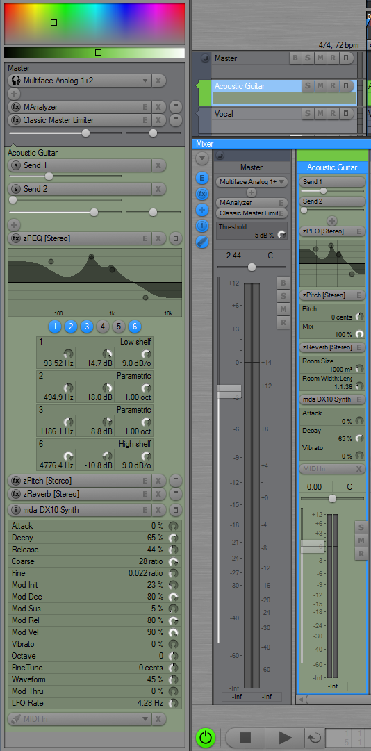
Thanks for the suggestions. I’m about to get beta2 ready, but meanwhile here’s a screenshot:

Notice the embedded editors in the mixer :D/
The rack editors can also show user selectable parameters. More info about this is coming in the beta2 release note.
Post if you have suggestions for more UI refinement.
December 13, 2009 at 03:25 #16987 H-manParticipant
^ Whoa!
December 13, 2009 at 04:44 #16988 ZynewaveKeymaster
Beta2 is up. The full change-log now read:
The inspector rack and the mixer strips can show embedded plugin editors. The Zynewave plugins will show their custom editor, while all other plugins use the Podium generic editor.
The parameters shown in the embedded generic editors can be configured separately for the rack and the mixer. Right-click the plugin selector and use the “embedded editor parameters” submenu to select the parameters. The selector menu in the rack also has shortcut commands for selecting and clearing all embedded parameters. The parameter selection applies globally to all instances of the plugin.
Added an “Editors” option button to the track inspector toolbar. When enabled, a show/hide button will appear next to each plugin selector in the rack.
A scrollbar will appear in the inspector rack panel if the rack is too large to fit in the panel. The panel can be resized by dragging the bottom of the panel.
Removed the redundant gain/pan/send controls as well as the embedded plugin editor from the track panel in the inspector.
The track panel in the inspector now always show information for the source track even if an effect track is selected.
Added “show embedded plugin editors” option to the mixer. Each plugin will show a generic editor, with the exception of the zPEQ plugin, which will show a miniature frequency response curve with handles for dragging frequency and gain of the EQ bands.
The generic plugin editors embedded in the mixer use a smaller font, and the parameter name and value dial are on separate lines.
Changed the appearance of the zPEQ editor response curve so that is centered around 0dB.
December 13, 2009 at 08:05 #16990 LiquidProj3ctParticipant
Very good!! 😯 I love the way that everything started to be integred and “compact”.
Please allow me two request. It would be marvelous a floating mixer. We can have a floating piano roll, a floating inspector… etc. But I need a floating mixer because it’s getting bigger and useful and in my screen I have always the arrangement and embedded editor visible. I don’t like switch between profiles (And I don’t want manage two profiles each time I do changes with new Podium versions). You could use F8 or similar to show/hide.
Second request about zEQ: options to hide zEQ’s parameter list in inspector.
December 13, 2009 at 16:09 #16999 thcilnnahojParticipant
That mini EQ is just adorable! 😳 Too bad zPitch’s UI isn’t really compatible with the mixer though.
Apart from that, I don’t really understand the way some things’re supposed to work in beta 2…
– The embedded parameter lists start out completely blank now…? That’s sure to confuse most people.
– Some plug-in parameter lists are so long that the menu extends beyond the screen (just try FF Volcano if you still have the demo). Of course I have the same problem when I try to automate it, but I can at least still access the whole list in the inspector. Being able to selecting parameters to be embedded from there would be vastly more comfortable to me. Plus, as always, going through a list and “ticking” the ones you want is much, much less annoying than opening the same menus again and again for one parameter at a time!
For the mixer, this is impossible altogether… hmm.Also, when you select “all embedded parameters”, it only seems to select those parameters that span the first two columns of the list. I guess it’s intentional as it says “limited to 64” in the help text, but it’s kind of mislabeled in that case.
– Another strange labeling, in my opinion, is the renamed “Automated Parameters” menu entry. If you browse this menu, you’re looking for parameters to automate most of the time – not looking at parameters that are already automated.
– Maybe this is a hassle, but the menu entries relevant to embedded parameters should probably only be available when the editors are enabled, as I feel they are not quite as useful to operate out of context.
– Any kind of resizing (mixer, inspector, etc.) is extremely sluggish here when even just one embedded parameter is shown in the mixer.
December 13, 2009 at 17:06 #17000 kingtubbyParticipant
You’re on a roll Frits 8) it’s looking really good so far. No doubt a few tweaks are still needed but I’m liking it very much.
Mart.
December 13, 2009 at 17:15 #17001 ZynewaveKeymaster
Question to you all:
I think the “[Stereo]” and “[Mono]” texts that are added to multiple configuration plugins are taking up too much space. What would be a better solution? Shorten the texts to “
” and “[m]”?December 13, 2009 at 18:41 #17002 LiquidProj3ctParticipant
@thcilnnahoj wrote:
The embedded parameter lists start out completely blank now…? That’s sure to confuse most people.
I second that, I spend around five minutes wondering how to use the blank list – maybe I should sleep more 😛
@thcilnnahoj wrote:
Plus, as always, going through a list and “ticking” the ones you want is much, much less annoying than opening the same menus again and again for one parameter at a time!
I was aware about it, that’s the reason of my first mockup in this thread.
After playing with new beta this evening I couldn’t figure what’s the utility of “automated parameters” in inspector. Why is it show in inspector if you cannot do nothing with it? (and you only can see one simultaneously). This isn’t critical, but I’d rather to see in that place a list of favorites parameter per track, because although we have a list per plugin every track is different and you need tweak different knobs each time.
Another thing that you could add would be an assignable XY pad, where you can put your two more frecuently parameters per track. It’s something incredibly creative. If you don’t believe it, try to do some sweeps and recordings with zPEQ, and try to do the same with knobs below it. Compare. Now imagine you can do the same with two custom parameters.
What would be a better solution? Shorten the texts to “
” and “[m]”?I think that’s ok.
I hope all this helps 🙂
December 13, 2009 at 19:10 #17003 kingtubbyParticipant
@LiquidProj3ct wrote:
Another thing that you could add would be an assignable XY pad, where you can put your two more frecuently parameters per track. It’s something incredibly creative. If you don’t believe it, try to do some sweeps and recordings with zPEQ, and try to do the same with knobs below it. Compare. Now imagine you can do the same with two custom parameters.
nice idea, +1 from me
s+m is *ahem* fine with me 😉
Mart.
December 13, 2009 at 20:12 #17004 H-manParticipant
Frits,
I have noticed that while multiple automation tracks can be viewed in the mixer, the rack (inspector) only shows the active one.
Is this on purpose? :-k
Also, setting a minimum strip width in the mixer seems to disable the Collapse button (in the mixer only).
December 13, 2009 at 20:18 #17005 H-manParticipant
@thcilnnahoj wrote:
Any kind of resizing (mixer, inspector, etc.) is extremely sluggish here when even just one embedded parameter is shown in the mixer.
I hate to stir things up but mine has become much better :-s and I have not updated drivers etc.
December 13, 2009 at 21:14 #17006 ConquistadorParticipant
@Zynewave wrote:
Thanks for the suggestions. I’m about to get beta2 ready, but meanwhile here’s a screenshot:

Notice the embedded editors in the mixer :D/
😯 The embedded editors in the mixer are some of the most delicious design work you have created yet! Simply exquisite.
I guess for some people the ability to creatively and attractively design User interfaces is a gift. Brilliant.
 December 13, 2009 at 22:39 #17008
 thcilnnahojParticipant
@H-man wrote:
@thcilnnahoj wrote:
Any kind of resizing (mixer, inspector, etc.) is extremely sluggish here when even just one embedded parameter is shown in the mixer.
I hate to stir things up but mine has become much better :-s and I have not updated drivers etc.
Correction to what I said: There doesn’t even have to be a single parameter visible – it’s enough that the “show editors” function is enabled. My guess is that it has to do with plug-ins that have long parameter lists, as it only seems to happen with those on my system. Here’s a test that worked for me: in an arrangement with just one or two tracks, load the free Voyager as the only plug-in, grab the mixer and drag it up and down as far as it goes. Try this with and without enabling embedded editors. CPU load is pretty much the same on my system for both, but the dragging is jerky with editors enabled.
As with all other things in Podium, the processing load on my graphics card (Radeon 3850) is rather low, so I doubt it has to do with that. :-kDecember 13, 2009 at 22:51 #17009 thcilnnahojParticipant
@H-man wrote:
Frits,
I have noticed that while multiple automation tracks can be viewed in the mixer, the rack (inspector) only shows the active one.
Is this on purpose? :-k
If you don’t mind me answering to that – yes, I believe it’s intended, as the signal chain in the rack is displayed really as a chain – a single element linking with the one further up. It probably should show all child/parameter tracks if a group track is selected, as they all flow into it of course. We’d have to come up with some way to arrange them so that they don’t look like they’re flowing into one another, though…
@kingtubby wrote:
s+m is *ahem* fine with me 😉
Me too… if you insist! 😮
December 13, 2009 at 22:53 #17010 UncleAgeParticipant
First off, I gotta give you mad props on this one Fritz! This adds a very nice touch to Podium.
1. I second the idea about ticking the parameters off that would appear in the editor. In addition it would be nice to have a way to save those for that particular plugin if possible.
2. There are columns of parameters beyond the edge of the screen when I click on Zebra. (as noted above)
3. S & M would be fine.
4. No sluggish behavior noticed so far.
And as Emeril would say, if you wanna kick it up a notch… Allow users to make custom editors for their favorite plugs! This could work as long as those making the editors agree to make them public so that we all could use them. I don’t know if you’re game for that kind of idea but with a few controls like the graph, xy pad some dials and switches I’m sure that there’s a few in here that could really make some kick ass custom editors 🙂
- You must be logged in to reply to this topic.
