Topic: Preview: Device icons
- This topic has 20 replies, 6 voices, and was last updated 19 years, 6 months ago by
 darcyb62.
-
September 5, 2006 at 11:41 #925
 ZynewaveKeymaster
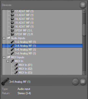
I’m currently trying out various icons that will help distinguish the different types of device mappings. Previously all device mapping objects were shown with the same ‘roll of cables’ icon. Here’s the icons for audio outputs, audio inputs and MIDI inputs:

Let me know what you think about these, and also if you have any ideas for icons for the remaining device mapping types: Mixer bus, plugin effect, plugin instrument, hardware effect and hardware instrument.
September 5, 2006 at 11:48 #7495 PodianerParticipant
Nice! They look great this far.
For a plugin instrument you could use a small piano roll to indicate that this is a plugin that can be “played”.
Effect plugins are hard to find a symbol for. Perhaps a simple “VST” or “FX” labelled icon would do?
just my 2 cents..
September 5, 2006 at 17:11 #7496 ConquistadorParticipant
I like the headphone icon for the outputs. The midi inputs and Audio inputs at a glance look a bit similar. Maybe the midi input can have an actual midi connector icon instead? So…not the plug that goes in (as it is now) but the actual midi socket instead.
As for the others…
Mixer bus: Possibly a 3D arrow or even better the letter S in 3D for send and R in 3D for Return I think that is logical for a tricky item to name.
Plugin effect: I think FX is fine.
Plugin Instrument: I would go for VSTI (you have to make these things obvious).
Hardware Effect…TC have quite a few rack FX units I think using one of these will clearly distinguish it from the VSTFX Icon suggestion above.
http://www.tcelectronic.com/Finalizer96k
Hardware Instrument…I think a synthesizer (not necessarily a Piano) would be a good idea here as it will be clearly distinguishable from the VSTI icon suggestion above for virtual insturments.
I think these suggestions will provide a clear and easy to understand presentation of various icons in Podium.
It’s tricky but I see no problems with these suggestions IMHO.
September 6, 2006 at 00:51 #7498 Doug BParticipant
@Zynewave wrote:
I’m currently trying out various icons that will help distinguish the different types of device mappings. Previously all device mapping objects were shown with the same ‘roll of cables’ icon. Here’s the icons for audio outputs, audio inputs and MIDI inputs:

Let me know what you think about these, and also if you have any ideas for icons for the remaining device mapping types: Mixer bus, plugin effect, plugin instrument, hardware effect and hardware instrument.
As well as different icons, different colours would make the category far more distinctive-like say green for midi, blue for audio.
September 6, 2006 at 00:59 #7499 ZynewaveKeymaster
As well as different icons, different colours would make the category far more distinctive-like say green for midi, blue for audio.
The problem with using colors for the icons is that it will not necessarily look good with various color schemes. That’s why the icons are mostly in graytone and tinted to the current color scheme.
September 6, 2006 at 01:09 #7500 Doug BParticipant
@Zynewave wrote:
As well as different icons, different colours would make the category far more distinctive-like say green for midi, blue for audio.
The problem with using colors for the icons is that it will not necessarily look good with various color schemes. That’s why the icons are mostly in graytone and tinted to the current color scheme.
Could the colours be made changeable like other gui widgets are now?
September 6, 2006 at 01:18 #7501 ZynewaveKeymaster
Could the colours be made changeable like other gui widgets are now?
I could add an icon and color selector in the device mapping properties, and even allow import of image files. But at present I think my time is better spent on more important things. If I can just create a set of default icons that can differentiate the device types, then I think that will do for now.
September 6, 2006 at 08:28 #7502 ConquistadorParticipant
@Zynewave wrote:
Could the colours be made changeable like other gui widgets are now?
I could add an icon and color selector in the device mapping properties, and even allow import of image files. But at present I think my time is better spent on more important things. If I can just create a set of default icons that can differentiate the device types, then I think that will do for now.
I like Improv’s colour option idea, but yes if it will take time away from more important things then maybe that really has to wait until some time in future. A nice idea though.
September 6, 2006 at 13:50 #7503 darcyb62Participant
@Zynewave wrote:
Could the colours be made changeable like other gui widgets are now?
I could add an icon and color selector in the device mapping properties, and even allow import of image files. But at present I think my time is better spent on more important things. If I can just create a set of default icons that can differentiate the device types, then I think that will do for now.
I agree… I want to see fade-ins/fadeouts/crossfades, I want midi control surface support… I want zCompress and zLimit… I want world peace… I want to drop a supercharger in to my ‘Stang. I want my daughter to hurry up and finish university… I want a holiday…
But I’ll take whatever comes my way.
Cheers…
Darcy
September 6, 2006 at 15:28 #7504 ConquistadorParticipant
@darcyb62 wrote:
agree… I want to see fade-ins/fadeouts/crossfades, I want midi control surface support… I want zCompress and zLimit… I want world peace… I want to drop a supercharger in to my ‘Stang. I want my daughter to hurry up and finish university… I want a holiday…
But I’ll take whatever comes my way.
Cheers…
Darcy
I guess Podium feature requests just just took a very unexpected turn. Frits may to have to raise the price of Podium to cope… 😆
That reminds me…crossfades. I was so looking forward to clip fades that I totally forgot about cross fades as well. Auto cross fades and clip fades especially are really needed in Podium. Workarounds exist but it is now a much needed / expected feature.
Some sort of extension of the really nice spline curves for clip fades and auto + manual cross fades would be very sweet indeed. Different shapes for the clip fades and auto cross fades would be great.
Just a gentle reminder Frits, I think it is on the future road map already IIRC 8)
September 6, 2006 at 15:36 #7505 PodianerParticipant
@Conquistador wrote:
@darcyb62 wrote:
agree… I want to see fade-ins/fadeouts/crossfades, I want midi control surface support… I want zCompress and zLimit… I want world peace… I want to drop a supercharger in to my ‘Stang. I want my daughter to hurry up and finish university… I want a holiday…
But I’ll take whatever comes my way.
Cheers…
Darcy
I guess Podium feature requests just just took a very unexpected turn. Frits may to have to raise the price of Podium to cope… 😆
That reminds me…crossfades. I was so looking forward to clip fades that I totally forgot about cross fades as well. Auto cross fades and clip fades especially are really needed in Podium. Workarounds exist but it is now a much needed / expected feature.
Some sort of extension of the really nice spline curves for clip fades and auto + manual cross fades would be very sweet indeed. Different shapes for the clip fades and auto cross fades would be great.
Just a gentle reminder Frits, I think it is on the future road map already IIRC 8)
+1 🙂
September 8, 2006 at 17:15 #7510 ZynewaveKeymaster
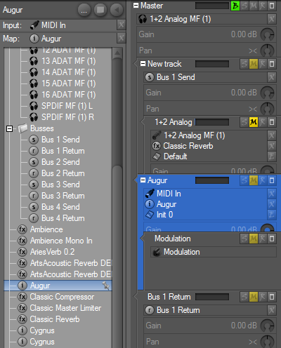
I tried with various photographic images to represent the devices, but it’s difficult cramming something recognizable into a 14×14 pixel icon. So I settled for something simpler, which I think turned out ok:

Also note that the icons for presets and parameters are updated, and that icons are shown in the track inspector panel headers. Can anyone recognize what the preset icon shows?
September 8, 2006 at 17:42 #7511 darcyb62Participant
That’s quite all right by me but didn’t have any issues with how they are currently. Is the preset icon a book? Or maybe a zEQ image?
September 8, 2006 at 18:48 #7512 ConquistadorParticipant
Wow! Podium looks so different. 🙂 It looks really nice.
 Nice work Frits!
I tried with various photographic images to represent the devices, but it’s difficult cramming something recognizable into a 14×14 pixel icon. So I settled for something simpler, which I think turned out ok:
Yes I can see the problem you faced, trying to fit a few letters into a tiny icon. I think you did a great job though. It all looks so much clearer and is much easier now to identify what is what at a glance. 🙂
Also note that the icons for presets and parameters are updated, and that icons are shown in the track inspector panel headers. Can anyone recognize what the preset icon shows?
Ok here goes…
As for the preset icon sorry Frits I think it looks like…a small packet? 😆Or maybe a small biscuit? 😆 😆 Ok just kidding but sorry I just cannot make it out. Frankly for consistency and to be identified easily I would simply use the letters pr for preset. Simple, legible and should look graphically consistent with the very nice new round fx and i icons.
I just cannot make out what exactly the Preset icon is currently Frits, sorry I have no idea. 🙁 No doubt the size of it is making what is probably very obvious just too difficult to make out. I think the pr suggestion is a good one IMHO. So what is the preset icon you used?
September 8, 2006 at 18:55 #7513 ZynewaveKeymaster
The preset icon is a MultiMediaCard flash memory. If you look really carefully at the print on the card, you’ll see that it can hold 64 MB 😆
I had a suspision that the icon would be hard to get. I just cannot think of another graphic icon that will make people go; “Ok, that’s a preset”.
How about the parameter dial icon, is that recognizable?
- You must be logged in to reply to this topic.
