Topic: Preview: Mixer redesign
- This topic has 40 replies, 11 voices, and was last updated 18 years, 11 months ago by
 pernst.
-
April 9, 2007 at 13:50 #9736
 sam cParticipant
thank you for all of the help Conquistador!!
May 5, 2007 at 01:26 #9857 ZynewaveKeymaster
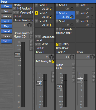
The latest mixer redesign (coming up in 1.86):

This shows the new extended track headers in the mixer. They now contain controls for mappings, presets and send dials. This is more space efficient for the bus send and effect insert tracks. There is no longer any need to show the mixer strip for these tracks, unless you want to check the meter of the track output.
I’m considering moving the map, preset and param rows on the mixer strips up to the mixer header as well.
Thoughts?
May 5, 2007 at 08:19 #9859 kingtubbyParticipant
Looks great Frits – a lot more space efficient.
Mart.
May 5, 2007 at 09:34 #9860 swindusParticipant
I like it too. Can’t wait to get the new version of the mixer under my fingers.
May 7, 2007 at 11:02 #9862 ConquistadorParticipant
This shows the new extended track headers in the mixer. They now contain controls for mappings, presets and send dials. This is more space efficient for the bus send and effect insert tracks.
This does look very good and makes sense. 🙂
There is no longer any need to show the mixer strip for these tracks, unless you want to check the meter of the track output.
Regarding the statement above…if we want to will we still be able to?
I’m considering moving the map, preset and param rows on the mixer strips up to the mixer header as well.
I think that is a good idea. Please yes.
Some questions….
What purpose will the Send button (under the Pan button) on the left of the screen serve now, possibly to hide / show the new send locations?
Will it be possible to hide / show all track headers?
Suggestion…
Looking at the image you posted I can’t help but feel that some sort of solution to the ” name cutoff” problem should possibly be considered.
In the image above… your have “Voxengo SP” (instead os Voxengo Span) and “Classic Master Li” which sounds like some sort of kung fu grand master or something fighting off 10 men all by himself 😆 (instead of displaying the full name Classic Master Limiter).
Of course being able to extend the width of these strips would be an option but…if that is a problem at least a tool tip could appear when the mouse cursor hovers over a name in the track header. This could show the full track name.
Move your mouse away and the tool tip disappears. I suppose it could be made optional but it seems quite a minor addition. Buit if other users would prefer not to have it then I suppose a global option might work.
It just looks odd right now to have names cut off in Podium like that when Podium really is a very polished product.
Podium really does have a formidable mixer now. It can be easy to forget how important this is but…it’s great fun to use as well 🙂
May 7, 2007 at 11:20 #9864 ZynewaveKeymaster
Regarding the statement above…if we want to will we still be able to?
Yes. Pressing the H key (or using the menu) will still toggle display of the mixer strip for the track.
What purpose will the Send button (under the Pan button) on the left of the screen serve now, possibly to hide / show the new send locations?
It shows/hides the send dials on the bus send headers. Hiding these can save some space when you are not adjusting send levels.
Will it be possible to hide / show all track headers?
The “compact headers” option is still available in the mixer view menu.
In the image above… your have “Voxengo SP” (instead os Voxengo Span) and “Classic Master Li” which sounds like some sort of kung fu grand master or something fighting off 10 men all by himself (instead of displaying the full name Classic Master Limiter).
Of course being able to extend the width of these strips would be an option but…if that is a problem at least a tool tip could appear when the mouse cursor hovers over a name in the track header. This could show the full track name.
Tooltip popup of the full name of the track and any objects assigned to it, is already on the plan. That’s why I’m moving the bypass/edit buttons from the right edge to the left edge of the strip. The tooltip popup will thus not obscure the buttons.
Since the last screenshot, I’ve attached arrows to the top of the headers, similar to the arrows in the tracks region. I’ve also moved the input and latency rows down at the bottom of the mixer, which further emphasizes the bottom to top signal flow.
May 7, 2007 at 11:48 #9866 ConquistadorParticipant
@Zynewave wrote:
Yes. Pressing the H key (or using the menu) will still toggle display of the mixer strip for the track.
Great thanks.
It shows/hides the send dials on the bus send headers. Hiding these can save some space when you are not adjusting send levels.
Ok yes that’s true.
The “compact headers” option is still available in the mixer view menu.
Good point yes.
Tooltip popup of the full name of the track and any objects assigned to it, is already on the plan.
I think it had indeed been discussed before, it was really brought up as a reminder. At least it is on the plan 😉
That’s why I’m moving the bypass/edit buttons from the right edge to the left edge of the strip. The tooltip popup will thus not obscure the buttons.
I understand that better now. Cheers.
Since the last screenshot, I’ve attached arrows to the top of the headers, similar to the arrows in the tracks region. I’ve also moved the input and latency rows down at the bottom of the mixer, which further emphasizes the bottom to top signal flow
Very nice. 🙂 The mixer is really a key showpiece in Podium now.
May 7, 2007 at 13:29 #9868 sam cParticipant
my thoughts are; it may be more effecient for the current design but it is too much information in a confined space that looks like clutter!
sorry i do not have any thoughts on improving it but i will look at it again later.
May 7, 2007 at 17:43 #9870 ZynewaveKeymaster
@sam c wrote:
my thoughts are; it may be more effecient for the current design but it is too much information in a confined space that looks like clutter!
sorry i do not have any thoughts on improving it but i will look at it again later.
I’ll appreciate any feedback on how to improve the layout. Clutter is something I definitely want to avoid.
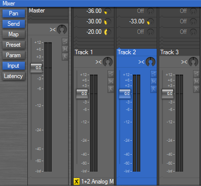
The row buttons allow you to select the elements that are shown. Here is an example where the map and preset rows have been deselected, for when you want to concentrate on mixing levels only:

This also shows the input row at the bottom and the signal flow arrows I mentioned earlier.
May 7, 2007 at 21:19 #9871 sam cParticipant
Frits, it sure looks better when you have deselected the map and preset. The input on the bottom is good too! Maybe my statement was rushed as I was not visualizing deselected buttons. The pic above looks good.
May 8, 2007 at 04:32 #9872 pernstParticipant
Fantastic! I haven’t been using the Mixer. I use the gain in the track and gains in the chain display. With this layout, it will be beneficial for me to use the Mixer. Great work all!
- You must be logged in to reply to this topic.
