Topic: Zynewave Logos
- This topic has 9 replies, 6 voices, and was last updated 17 years, 9 months ago by
 Conquistador.
-
June 9, 2008 at 00:33 #1626
 ZynewaveKeymaster
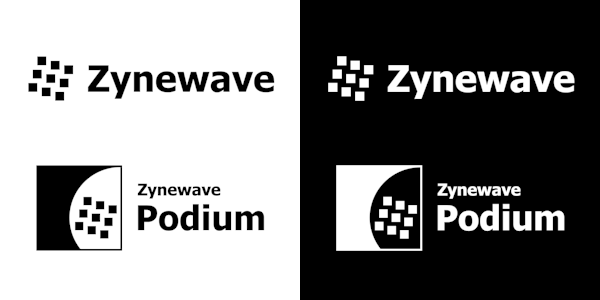
I’ve been asked to provide logo images as part of a partner signing with a new artist website (more info on that coming later in June). I’ve had the nine-tilted-squares logo since I launched the Zynewave website, but I’ve not had proper logo files until now. This is what I’ve come up with:

Click this link for a zip file with high-res images
I’m interested in your opinions on the logo design. Also if any of you have a graphic tool that can trace the .png files in the zip and convert these to .eps files, I would be grateful if you could email the .eps files to me. Or better still, recommend me some freeware utility that can trace and save .eps files.
June 9, 2008 at 01:48 #12565 Robert RandolphParticipant
I think it looks fantastic.
You can use inkscape (free) to trace to SVG and use easily found freeware to convert from svg to EPS.
June 9, 2008 at 03:17 #12566 H-manParticipant
Hi Frits,
I like the white text on black background, with the heavier font 😀
Initially couldn’t help but think that the these are quite plain by todays ‘Ray-traced’ standards however after flicking around the net for a while it is pretty clear that brand logos simply need to be immediately recognisable, clear, clean and aesthetically pleasing.
This ticks all the boxes IMHO. Nice!
Ben
June 9, 2008 at 04:04 #12567 UncleAgeParticipant
My vote goes for the white background. Sorry, I can’t help with the .eps files.
June 9, 2008 at 11:52 #12569 ZynewaveKeymaster
@H-man wrote:
I like the white text on black background, with the heavier font 😀
The white and black logo images are actually identical.
I made black and white versions so that partners can use the logos no matter if they use a dark or light page background color.
June 9, 2008 at 13:39 #12573 H-manParticipant
@Zynewave wrote:
@H-man wrote:
I like the white text on black background, with the heavier font 😀
The white and black logo images are actually identical.
I made black and white versions so that partners can use the logos no matter if they use a dark or light page background color.
Errrrmmmm …okay.
BTW, what is with the green square Podium logo on KVR?
June 9, 2008 at 15:46 #12577 ZynewaveKeymaster
@H-man wrote:
BTW, what is with the green square Podium logo on KVR?
That was the original logo I used when Podium was first announced on kvr. Ben apparently keeps it in his database and uses it every time a Podium update is announced.
June 9, 2008 at 16:09 #12580 ConquistadorParticipant
@Zynewave wrote:
I’m interested in your opinions on the logo design. Also if any of you have a graphic tool that can trace the .png files in the zip and convert these to .eps files, I would be grateful if you could email the .eps files to me. Or better still, recommend me some freeware utility that can trace and save .eps files.
Hmmm I have Photoshop which I think could do it (.eps files). I have other Adobe apps as well in that ballpark but I am rebuilding the PC I use for Video and Graphics at the moment so I cannot be much help sorry. 🙁
June 10, 2008 at 02:47 #12610 druidParticipant
Looks good to me! I like the white one myself, with black text, but I assumed that both were basically a choice for the site, not for us. 🙂
I agree with the comment about Inkscape.
July 10, 2008 at 20:14 #12801 ConquistadorParticipant
🙂 Just sent over some .EPS versions of the logos Frits. I hope that helps.
I had a look in Photoshop and it can export 3 different types of .EPS formats with further options on top of that! There is a Photoshop .EPS type, Photoshop DCS1.0 and Photoshop DCS 2.0 formats that I can export to, with additional options on Tiff formats e.t.c
Let me know if these .EPS conversions are Ok, if not then if the publisher / website requesting can specify a type, I should hopefully be able to make changes to meet the requirement.
- You must be logged in to reply to this topic.
