Topic: Preview: Compact track layout
- This topic has 244 replies, 25 voices, and was last updated 18 years, 4 months ago by
 caco.
caco.
-
October 30, 2007 at 07:45 #11150
 acousmodParticipant
I find this new fader very good : it integrates perfectly in the GUI (better than the glass one), doesn’t take too much space and is easy to read and to grab.
For me it is perfect.October 30, 2007 at 08:30 #11151 ConquistadorParticipant
My thoughts on Beta 10 changes…
>applause< :mrgreen: As Acousmod said “it integrates perfectly”. It looks like it has always been there. A sure sign of hitting the right spot. Excellent. Better visibility, and GUI consistency has been maintained with a nice designers touch. @Zynewave wrote:
I also moved the faders to the top of the track header, and dropped the glass-look. I’m looking forward to comments on this new look.
I think it’s fine at the top. Probably better there. I think it’s more intuitive to use at the top of the track header. Nice.
Thanks for responding to the feedback about the text size and adding the “L” and “R” letters when panning. It’s just right now.
Cheers Frits! 🙂
October 30, 2007 at 09:42 #11152 swindusParticipant
Agreed, very nice!
One thing is still missing in the track header. We can create now bounce tracks, effect tracks and we can map plugins to those tracks. What I’m still missing is to assign an input map in the track header. After assigning an input map in the mixer or inspector it is possible to change the input map but there is no way to add/change an input map when no input map was assigned before.
October 30, 2007 at 13:02 #11154 thcilnnahojParticipant
Hm, I prefer the look of beta 7 after all, but I realize you can’t have an option for every little thing. So who am I to stand in the way of progress! 😆
But this one’s bugging me a little, so here’s a request:
Would you still consider making the sliders, at least the panning, adjustable by moving the mouse on the y-axis? (With the dials, both ways were fine.)And a question: Will all corresponding dials in the GP, and especially the ones on parent tracks in the chain panel be eventually replaced with sliders? I figure they’d have to be pretty tiny again to fit.
October 30, 2007 at 16:13 #11155 Robert RandolphParticipant
the new beta is certainly a big improvement. Im liking the direction taken at this point 😀
October 30, 2007 at 17:28 #11156 ConquistadorParticipant
@swindus wrote:
Agreed, very nice!
One thing is still missing in the track header. We can create now bounce tracks, effect tracks and we can map plugins to those tracks. What I’m still missing is to assign an input map in the track header. After assigning an input map in the mixer or inspector it is possible to change the input map but there is no way to add/change an input map when no input map was assigned before.
Swindus…apologies in advance if I have misunderstood your request 😉 but if you right click on your midi / audio input mapping and select the “Auto-Assign To Focus Track” command, does this not already provide a set and forget feature that negates the need for an input mapping command in the new track headers?
 October 30, 2007 at 19:08 #11158
 swindusParticipant
Conquistador … thanks for answering. I know this feature but it does not work with multiple midi input devices. And sometimes I want a midi input stay on a track for cc messages and select another track at the some time or playing drums with a trigger finger and some pads with a keyboard or ….
Agreed, the “Auto-Assign To Focus Track” works well in a lot of situations but sometimes it’s not the best option and I really like how it works in the mixer, click, choose, ready to go.
I just mentioned this because it is the only thing left to add to the track header and the mixer and inspector can be hidden without missing them. For me it would be very useful but thats just me …. 😀
October 30, 2007 at 20:08 #11159 ConquistadorParticipant
@swindus wrote:
Conquistador … thanks for answering. I know this feature but it does not work with multiple midi input devices. And sometimes I want a midi input stay on a track for cc messages and select another track at the some time or playing drums with a trigger finger and some pads with a keyboard or ….
Agreed, the “Auto-Assign To Focus Track” works well in a lot of situations but sometimes it’s not the best option and I really like how it works in the mixer, click, choose, ready to go.
I just mentioned this because it is the only thing left to add to the track header and the mixer and inspector can be hidden without missing them. For me it would be very useful but thats just me …. 😀
He he…ok I can see why you asked now… agreed it does make sense 🙂
October 30, 2007 at 20:16 #11160 ZynewaveKeymaster
Would you still consider making the sliders, at least the panning, adjustable by moving the mouse on the y-axis? (With the dials, both ways were fine.)
I think this will be counterintuitive with horizontal sliders. You can hold shift and drag to make fine adjustments to pan. You can also drag out the width of the track headers to increase the size of the sliders. Is the problem only the lack of precision when dragging the pan slider?
Will all corresponding dials in the GP, and especially the ones on parent tracks in the chain panel be eventually replaced with sliders? I figure they’d have to be pretty tiny again to fit.
So far I have no plans to replace the dials in the group panel and elsewhere in the track inspector.
October 30, 2007 at 20:19 #11161 ZynewaveKeymaster
I just mentioned this because it is the only thing left to add to the track header and the mixer and inspector can be hidden without missing them. For me it would be very useful but thats just me ….
Don’t worry. An “Assign input” submenu will be added to the lane header menu.
October 30, 2007 at 21:20 #11162 swindusParticipant
Very nice, thanks!
October 31, 2007 at 17:35 #11165 ZynewaveKeymaster
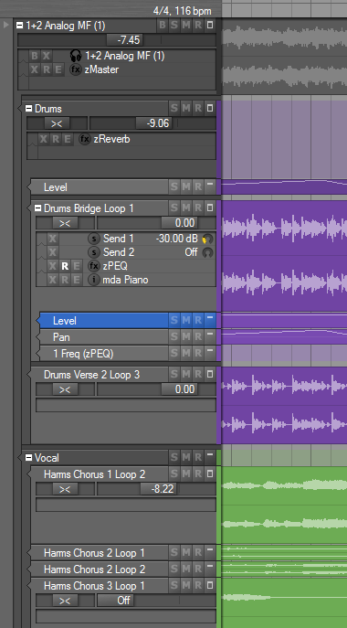
More experiments. This one I would really like your opinion about. Previously the entire track lane headers have been colorized with the track color. With the recent addition of the chain panel to the headers, I think it is becoming too overwhelming with the colors. Depending on the colors selected for the track, it can be difficult to distinguish lit BSMRX buttons and text. I’ve tried a layout where only the right edge of the track lane is colored, and the main header area is using the normal face color. This also makes it easier to distinguish the currently selected track:

Furthermore you may notice that I have added a spacing between track groups, making a clearer division between groups and parameter tracks.
Anyone still prefer the old colorized track headers? Otherwise they are going out.
October 31, 2007 at 18:30 #11166 swindusParticipant
That’s a great idea! Indeed it can be difficult to distinguish the currently selected track with the current coloring of the track headers.
October 31, 2007 at 19:58 #11167 ConquistadorParticipant
Nice. I like it.
It is a delicate and pleasantly understated change that gives a classy look to Podium. A simple strip of colour I think works very well. The “Drums”, “1Freq (zPEQ)” and “Vocal” tracks interestingly can still be quickly identified even though there are no events that are visible (in the screen shot at least) on those tracks.
This is impressive because the “1Freq (zPEQ)” and “Vocal” tracks in particular are minimized, yet they can still be identified quickly with the new strips. The coloured track bands that stretch across the arranger (from a previous Podium update) work very well with the new slim strips to aid the easy identification of minimized tracks.

Furthermore you may notice that I have added a spacing between track groups, making a clearer division between groups and parameter tracks.
Another nice touch. Thanks.
Anyone still prefer the old colorized track headers? Otherwise they are going out.
Out with the old, in with the new IMO but…how does the Mixer look now? Are you making these changes there as well or leaving it as is? It might be better to offer a mix of the two colour processes, perhaps leaving the mixer as is.
I like seeing a fully coloured mixer strip in the mixer but I do prefer your new look track strips for track level viewing. 🙂
November 1, 2007 at 01:07 #11168 ZynewaveKeymaster
how does the Mixer look now? Are you making these changes there as well or leaving it as is?
I’m not changing the mixer this time around.
- You must be logged in to reply to this topic.
