Topic: Preview: Detached track inspector
- This topic has 48 replies, 12 voices, and was last updated 18 years, 7 months ago by
 rinxai.
-
November 21, 2007 at 19:05 #1468
 ZynewaveKeymaster
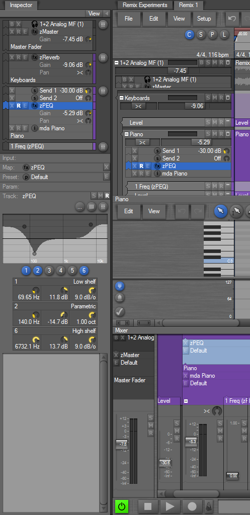
As you may know the track inspector is currently embedded in the left edge of the tracks region. Originally the track inspector only had the five object panels. The space requirements have grown with the addition of embedded plugin editors and recently the group panel. I’m experimenting with removing the inspector from the tracks region, and instead embedding it at the left edge of the browser window. See screenshot below. The “Inspector” tab at the top works just like the current “List” tab. This provides the maximum available vertical space for the inspector. I think it also cleans up the graphics of the tracks region, embedded sequence editor and the mixer, which now aligns nicely. Another benefit is that the inspector can be shown in browser windows where you e.g. only show mixers.
I would prefer to get rid of the old embedded inspector, so please reply if you have a good reason for keeping the old embedded inspector.
 November 22, 2007 at 04:49 #11296
 darcyb62Participant
I like it… Your idea that is… The old can go…
November 22, 2007 at 05:59 #11297 Igr0Participant
It’s better.
November 22, 2007 at 23:04 #11298 estwingParticipant
Hi Frits ,
thanks for all your effort with 195.
I am very happy with the the inspector as is ( i do miss the full colour from 194).
will this change obscure some of the toolbar when the inspector is open ?. I use expanded mode with the inspector open mostly. In your screenshot, to me the information in the compact track header is conveyed just as well by the inspector and even better if I was to reduce the track hight to fit more lanes on screen.mart.
November 22, 2007 at 23:40 #11299ZynewaveKeymasterwill this change obscure some of the toolbar when the inspector is open ?.
Opening the inspector will shrink the space available for the entire editor instead of just the tracks region, so the toolbars will have less horizontal space. Depending on the screen resolution you use, you may have to trim the elements in your toolbars to avoid that the right edge of the toolbar becomes obscured. That’s about the only disadvantage I can see with the new layout. Overall I think this new layout is a big improvement.
November 23, 2007 at 17:17 #11300estwingParticipanthi Frits,
currently I have all the elements i need in one toolbar (its a very tight squeeze) as this also maximises the vertical space on my screen,If the inspector extended to below the toolbar taking just the empty space on the left of the timeline ruler etc. it would not be so bad, but I think my opinion may be in a minority on this subject.
mart.November 23, 2007 at 18:48 #11301 acousmodParticipant
If the inspector extended to below the toolbar taking just the empty space on the left of the timeline ruler etc. it would not be so bad, but I think my opinion may be in a minority on this subject.
I agree.
Of course, I have not tested yet, but I think that I would not like to have the left menus and my toolbars jumping to the right each time that I open the Inspector panel. I am used to have them keeping always the same place.
The List panel at the right edge has not this drawback.November 25, 2007 at 15:20 #11309 ConquistadorParticipant
@Zynewave wrote:
Depending on the screen resolution you use, you may have to trim the elements in your toolbars to avoid that the right edge of the toolbar becomes obscured. That’s about the only disadvantage I can see with the new layout. Overall I think this new layout is a big improvement.
I like the idea. Your screenshot presents an easier to use inspector. However it appears to be at a cost…what about the large transport, will that be moved over to the right as well?
User feedback appears split on this issue. I do not really think an option is necessary but then again I can see the clear benefit of your suggested change but also an equally obvious disadvantage as well. So an option may be the only solution.
If a full screen length Inspector is the goal Frits, you might have to settle for the slider idea I suggested some time ago for the GP instead. It looks like it is either that or everything gets moved to the right to accommodate the Inspector idea you have suggested.
It is a bit tricky, but I don’t think I want to lose a full length transport at the bottom of my screen. The slider idea for the GP solves that problem IMO. Ideally I would like the tabbed inspector to be optional not a fixed default with no way back.
I would guess the full length inspector can be dragged left or right using the small double arrows in the same way the List view can? I would have to see how this works but if that is really the case…
@Zynewave wrote:
The “Inspector” tab at the top works just like the current “List” tab.
Then I would say…lets have the tabbed Inspector but also consider other users by letting them optionally switch back to the older Inspector view.
Your comment here really sold me the idea now that I have thought it through…
@Zynewave wrote:
Another benefit is that the inspector can be shown in browser windows where you e.g. only show mixers.
Unless I misunderstood this, it means I will be able to drag the mixer up all the way to the top of the screen and have full access the tabbed Inspector. Pretty Cool. 8)
I just hope the large transport can ‘fit in’. 🙂
November 25, 2007 at 17:04 #11314estwingParticipanthi Frits,
is there a reason why the gain and pan dials are shown above the track names in the inspector ?,I always seem to associate them with the the track title above, ie in your screenshot at a glance I would wrongly assume the gain applied to the zPEQ and not mda Piano.Also they are upside down compared to the view in expanded mode.
mart.
ps, the tip about rearranging the inputs list worked a treat.November 25, 2007 at 17:43 #11318ZynewaveKeymasteris there a reason why the gain and pan dials are shown above the track names in the inspector ?,
The gain and pan dials are positioned in the list according to the order they are processed in the signal flow. So the output of mdaPiano is adjusted with the gain and pan before going into zPEQ. The list thus always shows the correct signal flow, from bottom to top, as indicated by the arrow column at the left edge.
November 25, 2007 at 17:57 #11319estwingParticipantheaders.
it just seems easier to”read” in the order it is displayed in the track
hi Frits,November 25, 2007 at 18:35 #11320ZynewaveKeymaster@estwing wrote:
headers.
it just seems easier to”read” in the order it is displayed in the track
hi Frits,I don’t understand?
November 25, 2007 at 18:47 #11321estwingParticipantHi Frits
obviously I get the signal flow approach, in this case mda piano-zPEQ-Send2-Send1
but if you look at the mda Piano group track lane in expanded mode the gain and pan dials would be read below the title”mda Piano”,opposite to the way in the inspector. Sorry but i was just trying to illustrate this with my previous post.
MartNovember 26, 2007 at 08:49 #11322ConquistadorParticipant@estwing wrote:
Hi Frits
obviously I get the signal flow approach, in this case mda piano-zPEQ-Send2-Send1
but if you look at the mda Piano group track lane in expanded mode the gain and pan dials would be read below the title”mda Piano”,opposite to the way in the inspector. Sorry but i was just trying to illustrate this with my previous post.
MartTotally agree with this. I also understand the thinking behind it Frits, but it just looks odd.
To illustrate it further…

Clearly one can see that the Gain and Pan for the Trilogy track are placed under the Track header in the arranger view but also over it in the GP. It’s inconsistent.
I will say this though…in Compact mode the Gain and Pan controls are placed above track headers or in the Track chain panel headers above all other tracks. This works very well IMO. But go to Expanded mode and you have the graphical inconsistency that estwing brought up.
As the Gain and Pan above track headers is a new design then going forward maybe you could…
a. Bring the new Gain and Pan sliders into the GP to replace the dials and also add them to Expanded mode track headers for consistency.
b. Place the current Gain and Pan dials below the track headers in the GP (in Expanded mode) so that they mirror the graphical layout of Tracks in the arrange view.
c. Add the new Gain and Pan sliders to the GP and do away with Expanded mode altogether. Adding any remaining functionality found in that mode to Compact mode. So effectively there would be one default mode.
November 26, 2007 at 11:23 #11324ZynewaveKeymasterI know about the inconsistency between the inspector and the expanded mode headers. I’m not changing expanded mode before I feel compact mode is complete. If compact mode turns out to be a success, I’m hoping I can ditch the old expanded mode UI and only use the compact UI. The expanded mode will then become sort of an “unrestricted” mode where some of the limitations imposed in compact mode will be removed.
- You must be logged in to reply to this topic.