Topic: Preview: Some UI changes in 1.98
- This topic has 36 replies, 18 voices, and was last updated 18 years, 5 months ago by
 Conquistador.
-
January 27, 2008 at 21:30 #1521
 ZynewaveKeymaster
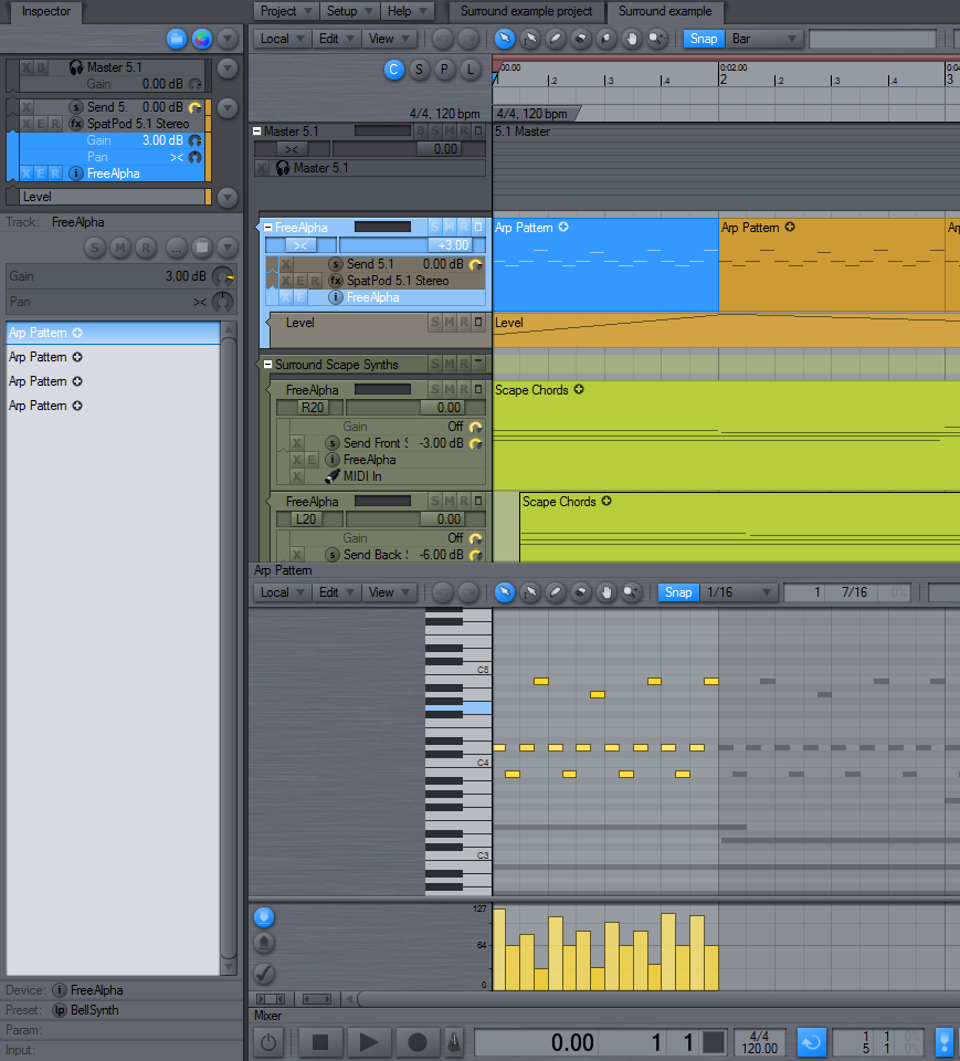
I’ve grown tired of the old bulky menu buttons in the editor toolbars, so I tried a different design, which results in a more consistent appearance of all menu buttons. As can be seen in the screenshot below, a down arrow image is now used to indicate menu buttons. The menus have been rearranged slightly, and the global project, setup and help menus are placed above the editor. The default edit toolbar is now slimmer and also has a redesigned snap/quantize menu.
Comments?
 January 27, 2008 at 21:40 #11629
 TechnophobiaParticipant
Looks very slick to me Frits.
It’s unusual to have a excellent coder/developer that is also graphically adept. Your continued design improvements make the overall look of Podium a real winner. 🙂
January 27, 2008 at 22:17 #11631 PodianerParticipant
Looks much more consistent than before. Nice changes Frits!
Even as a long time Podium user, some of your updates often make me think I am working with a complete new application 😛 which is very good btw! So, keep up implementing your excellent design ideas.. 🙂January 28, 2008 at 04:23 #11636 UncleAgeParticipant
Nicely done. And yes, it does give things a more consistent look and feel.
January 28, 2008 at 07:20 #11637 SlomoParticipant
Oh Yeah! Spot on! It seem like you nail it every time.
January 28, 2008 at 13:42 #11645 swindusParticipant
Looks good!
January 28, 2008 at 15:55 #11648 jpleongParticipant
Can you provide a snapshot of what the button looks like when clicked?
JP
January 28, 2008 at 16:32 #11649 kingtubbyParticipant
Just to add my approval Frits – not that you need it of course 🙂
What’s the ‘local’ button for? I don’t think I’ve seen that before…Mart.
January 28, 2008 at 17:41 #11652 ConquistadorParticipant
@Zynewave wrote:
Comments?
If I could I would pay you to simply design all day! Really nice Frits.

I was going to make some suggestions for Podiums UI but I have simply not had the time for a full mock up but I think this screen shot should tell the story…

A ribbon for Podium to eliminate drop down menus (or at least make them optional).
I read this articleon UI design and it was quite an eye opener. I definitely suggest you read it at some point and indeed anyone else interested in UI design in more detail.
The idea in more detail:
Arrangement properties should be taken care of on the Project start page before the arrangement is created. So the tabs for a new look UI for Podium could be for…
Composition
Editing
Mixing
Mastering
SaveOr (as it would be seen on screen horizontally)
Tabs for Composition Editing Mixing Mastering Save
Something that provides a logical progression for a producer. One would compose first , mix then (if doing so internally) move on to Mastering. Editing I would say might be placed aftercomposing as a tab.
This kind of placement of tabs is incredibly efficient for workflow and as of today I do not know of any host that provides this kind of logical layout for menus.
I have used Office 2007 for about 3 months now and there are many highly useful features in Word 2007, Excel 2007 and Outlook 2007 that were there all along that I just could not find easily and as a result not used them until now. The ribbon interface is far more logical, faster and incredibly intuitive to use.
Notice that the tabs are arranged in terms of the order of tasks you are likely to perform not just what you need. The order you will likely need them is the driver for the placement of the tabs. This makes far more sense.
Microsoft were running out of space for drop down menus and were getting requests for features in Office 2007 that were already in Office 2003! They simply had too many drop down lists and menus.
I initially tried the demo of Office 2007, Word 2007 in particular and was sold on the new interface very quickly.It is sooooooooo different from the older drop down menu approach. I am getting things done far quicker and getting far more value for money out of the software as a result.
Also amazingly I have zero need for right clicking. Every feature I need is accessible from that Ribbon at the top. You can work in Word 2007 without anything ever dropping down to obscure your workplace. Same screenspace as previous versions of word but this time that same space is being put to far better use.
So how would this grouping work in Podium ?
Two ways…
1. Keep the current groups as they are but place them in their own ribbon. So instead of a drop down menu each for File, Edit, View and Setup we could use tabs with a Ribbon underneath it showing the contents of those tabs.
Something that can be dragged into view like the mixer so that one can easily revert back the older drop down menus if need be. A global option would be a good idea to set and forget.
2. Re structure the menus to reflect a logical workflow pattern. Something that will fit into a Save Compose Edit Mix Master Ribbon layout.
Even track level options can fit into these tabs as well as the File, View e.t.c menus to eliminate the need to use them. Everything as in Word 2007 can be accessed from a logical palcement of tabs that mirror a typical users workflow.
Thoughts?
January 28, 2008 at 18:24 #11653jpleongParticipantGreat article link, thanks for sharing!
JP
January 28, 2008 at 20:03 #11654 sam cParticipant
very nice Frits!
January 28, 2008 at 21:09 #11655 rinxaiParticipant
Looks tighter. 🙂
+1 contextual ribbon
January 28, 2008 at 22:17 #11656UncleAgeParticipantThanks for sharing the link Conquistador. Good stuff in there. I’m going to play a little devil’s advocate here with your example. My intent is not to totally disagree however, but to open things up a little more in the discussion.
I am a long time user of MS Office, back to Office 95. And like a lot seasoned users (with any newly updated app really) the new MSO was a mixed bag. Yes it looks nicer. And yes that new ribbon bar is probably helpful to new users and users who prefer to use their mouse. I am one of the MSO users that prefers the keyboard shortcuts though. And for me the new look of MSO meant that I lost more screen space for my spreadsheets in Excel without adding much for me as I prefer to keep my hands on the keyboard once they are there. Not a showstopper really but it wasn’t anything that was received with a warm welcome from me and those that work with me. As always, things change and one must learn to change with them.
I would only add that if Frits were to adopt this type of interface maybe a function key could be assigned to make it go away much like the F7 key functions for the mixer (I use that F7 key a lot!). And maybe not entirely away. Maybe this function key would toggle between the full-blown ribbon and a custom/minimal set of controls for the power/seasoned users. Just my $.02.
January 28, 2008 at 22:23 #11657UncleAgeParticipantPlease bear in mind that my post is not to just be argumentative. I am a minimalist, although you would not think so from some of my posts. And as such I prefer it when toolboxes and dockable windows are easy to dispatch out of the way. I don’t use the inspector as much as some of the rest of you and I appreciate that it can be hidden in the same manner as the mixer. And as a quick side note: I always appreciated Tracktion because of this approach. Just had a cleaner feel to it is all (this is opposed to say Sonar or Cubase).
January 28, 2008 at 23:12 #11658ZynewaveKeymasterThanks for the comments.
Can you provide a snapshot of what the button looks like when clicked?
The button is highlighted with the select color while the menu is open, just like the old menu buttons.
What’s the ‘local’ button for? I don’t think I’ve seen that before…
I’ve since renamed that to “File”. It contains menus for opening the properties dialog for the arrangement/sequence/sound, as well as file/export commands for the object shown in the editor. I tried with “Local” because the new “Project” menu contains file commands as well.
- You must be logged in to reply to this topic.