Topic: Preview: Some UI changes in 1.98
- This topic has 36 replies, 18 voices, and was last updated 18 years, 5 months ago by
 Conquistador.
-
January 28, 2008 at 23:29 #11661
 ZynewaveKeymaster
@Conquistador wrote:

A ribbon for Podium to eliminate drop down menus (or at least make them optional).
Thanks for the link. I did not know anything about the “ribbon” control. I don’t see myself applying this to Podium in the near future. If it took a bunch of MS engineers three years and three total rewrites before getting this right for MS word, I think I better stick to my current design! 😉
I also think that there are features in Podium that can accommodate for the different tasks and workflows that you go through in the creative process. I’m thinking about the project start page, and the possibility to create different editor profiles that you can quickly swap between with F8.
January 29, 2008 at 01:34 #11668 duncanparsonsParticipant
Very nice Frits 🙂
glad to hear your comments about the ribbon. Like UncleAge, I started using office a long time ago (1994 on Win3 boxes). Whilst M$ went on for a long time about requested features already being there between in v2003, they said the same thing when Off200 came out (referring back to Off97). The thing that got things ‘lost’ in menus wasn’t the design of menus, it was the design of the auto hiding of options (which strangely came with O2K…).
I have recently started using Office2007, and it has reduced my productivity in word, excel and access massively. There were countless functions that I could find and use, and had instantly available, which I now have to go searching for. Even really simple stuff. Like the save icon in Word – I don’t want to admit how long it took before I found that they’d moved it OFF the place where they claim you should be finding stuff…
I’ve read their documents on the ribbon, I did quite a thorough examination of it when the betas were out, since the company I worked for at the time (Sage, the accountancy software company) had me redesigning the UI for their flagship accounts production app. At the time I could see where they were coming from, but could also see that the direction they were taking was questionable. It’s now out, and I still question it. I ended up rejecting their denouement, and rolled my own, based on Sage’s schemes of the time, along with my own modifications.
FWIW, I’ve never been a big fan of menu systems either. I have written a number of successful medium to large scale database apps, very few of which employed menus. In 2002 I even had one that eschewed the std menu paradigm to such an extent that it foresaw a ribbon-like interface. It was the one design that my users had the most trouble using.All that being said, folks are having to get used to the ribbon.
There’s also OpenOffice 😉Sorry to have gone on a bit. 🙄
To those who love the ribbon, I respect that. I must confess, I don’t.But, i’m sure we can all agree that what’s Frits is proposing is excellent 🙂
DSP
January 29, 2008 at 08:36 #11669 rinxaiParticipant
@Zynewave wrote:
If it took a bunch of MS engineers three years and three total rewrites before getting this right for MS word, I think I better stick to my current design! 😉
I also think that there are features in Podium that can accommodate for the different tasks and workflows that you go through in the creative process. I’m thinking about the project start page, and the possibility to create different editor profiles that you can quickly swap between with F8.
That makes sense!
I’ve not used M$ office (prefer open office) with the ribbon thingy, but that article did make for interesting study on GUI development. Perhaps that approach is better suited for programs with extensive menu options.
Frit’s approach to GUI design and implementation is imo already one of the best amongst DAWs. It does not need any major reworking. I suppose its a case of don’t fix it if it ain’t broke.
😉
January 29, 2008 at 09:28 #11670 ConquistadorParticipant
@UncleAge wrote:
I would only add that if Frits were to adopt this type of interface maybe a function key could be assigned to make it go away much like the F7 key functions for the mixer (I use that F7 key a lot!). And maybe not entirely away. Maybe this function key would toggle between the full-blown ribbon and a custom/minimal set of controls for the power/seasoned users. Just my $.02.
Sounds fine to me. I always saw it as something optional and I know you are not trying to be argumentative. Each view expressed here on this forum is just as important as any other (post count or not) IMO. I am always interested in other peoples opinions. 😉
@Zynewave wrote:
Thanks for the link. I did not know anything about the “ribbon” control. I don’t see myself applying this to Podium in the near future. If it took a bunch of MS engineers three years and three total rewrites before getting this right for MS word, I think I better stick to my current design!
Hi Frits. Judging by your terrified repsonse 😆
“If it took a bunch of MS engineers three years and three total rewrites before getting this right for MS word, I think I better stick to my current design!”
…it sounds like you think the idea is bringing Microsofts ‘problem’ to Podium, the only way I can see you coming to that conclusion is if you read the article link, but not my suggested adaptation of the solution found in that article by Microsoft for Podium, which is explained in the rest of my post earlier.
I was was referring to the solution they found being adapted to Podium not bringing the problem they had to Podium! 🙂 Podium of course does not have the problem Microsoft had…not currently has.
The idea is to enhance what Podium has already with the ribbon UI idea (which is a solution not strangely as you see it, a problem for Microsoft engineers) not sure what the connection is here.
If your reason for not being interested is because it took Microsoft 3 years to get it right….I am bit puzzled about that. Would it be more of interest to you if they took 3 weeks to get it right or 3 days? 🙂 Surely the time frame to find a soltuon has nothing to do with the use of the solution.
I am just trying to understand your comments here.
It’s like saying you don’t like the idea because you don’t want their problem. What problem is that? They don’t have the problem any more.
The reason why I explained the idea in detail was so you could see how their solution can be adpated into Podium. 75% of PC Pro’s readership liked the ribbon. It’s different of course but has to be, to improve upon the previous design. It’s far better than any menu UI I have ever used in any app. by a long way. So much more logical and easier to use.
But as with any idea some will like it some will not. Nothing wrong with that. But if your fear a “Microsoft problem” making it’s way into Podium then I don’t think you read my post past the article link which might explain your response. Seriously. It’s the solution I am suggesting but it sounds like you think it’s Microsofts problem I am suggesting. Which I don’t understand. I am now far more interested in the reason for your comment than if you like the idea or not. 🙂
I also think that there are features in Podium that can accommodate for the different tasks and workflows that you go through in the creative process. I’m thinking about the project start page, and the possibility to create different editor profiles that you can quickly swap between with F8.
Yes, of course there are features in Podium that already accomodate the different tasks one would go through during any creative process. Many. I am not sure why you think the suggestion I made suggests that is not already the case. The ribbon UI idea is a refinement of those creative options in Podium.
Anyway…it’s up to you it was just an idea I had based on my own experience that I think as an optional feature would be fantastic. I think this idea is far better than any UI idea I have ever seen. But in any case as always lets see how the next update ( 1.98 ) evolves 🙂
January 29, 2008 at 09:58 #11671ZynewaveKeymasterIf your reason for not being interested is because it took Microsoft 3 years to get it right….I am bit puzzled about that. Would it be more of interest to you if they took 3 weeks to get it right or 3 days? Surely the time frame to find a soltuon has nothing to do with the use of the solution.
I am just trying to understand your comments here.
What I gather from the article, was that a major part of the development time was spent figuring out how to lay out the ribbon control, and what commands should be available in the ribbon. Implementing the basic functionality of a ribbon control in Podium is not a problem, but it is going to take a HUGE amount of time to figure out what the ribbon should contain. Your suggestions for the main tabs is the easy part. It’s almost certain that each Podium user would want something different in the ribbon, possibly more so than the typical MS word user. That’s why I originally designed the editor profile system, which allows the user to configure the entire workspace.
January 29, 2008 at 11:24 #11672ConquistadorParticipantThanks for taking the time to expand your views on this a bit more. I was a bit confused by your response 🙂
@Zynewave wrote:
What I gather from the article, was that a major part of the development time was spent figuring out how to lay out the ribbon control, and what commands should be available in the ribbon.
Correct. Yes.
Implementing the basic functionality of a ribbon control in Podium is not a problem, but it is going to take a HUGE amount of time to figure out what the ribbon should contain.
Yes and no IMO. Yes a longer time if we re organise the existing menus into a more logical workflow UI (greater benefit) but no it should not take long at all to figure out the contents of the tabs if you approach the idea using the first suggestion I made as to how to implement it…
“1. Keep the current groups as they are but place them in their own ribbon. So instead of a drop down menu each for File, Edit, View and Setup we could use tabs with a Ribbon underneath it showing the contents of those tabs.”
Or put another way…the tabs in the ribbon will mirror the existing menu contents exactly as they are now.
Your suggestions for the main tabs is the easy part. It’s almost certain that each Podium user would want something different in the ribbon, possibly more so than the typical MS word user.
I can see how people might want there own variation of the ribbon but if you simply move the current menus for File, View e.t.c into a ribbon UI tabbed design, the actual layout would be identical to the current one.
Difference? No more drop down menus. That is really all I was suggesting… a further refinement of an already very good design, not a massive overhaul of a desparately problematic UI. Far from it.
I did say if I could I would pay you to design all day and you know I have many times said how much I admire your design skills over the years. It is quite obvious you really know your way around UI design.
Personally I cannot see how a Podium user would want more variations in a ribbon in Podium than a MS word user. That is why I suggested option 1 to eradicate that problem if it became a problem.
Word users cover the globe with hundreds of millions of users with easily just as many different approaches to Word. I understand how we might want different things in it (using my second suggestion) but surely not ever nearly on the scale of variation as Microsofts globally used Word product customer base! 🙂
That’s why I originally designed the editor profile system, which allows the user to configure the entire workspace
Personally I really like this idea. It is very powerful and very flexible.

The editor profile is very powerful. I like it. No question, Perhaps an idea from a Microsoft product brings images of bloat, lost productivity and an overpriced product…I was not a great fan of Word 2002 at all, and used it out of necessity but it is the complete opposite now. To my total amazement.
The Editor profile could possibly be extended to allow for users to add whatever they want to the ribbon. No need to spend time thinking about every users possible variation, let a user choose. The Editor profile will not / cannot do away with drop down menus. The ribbon can.
Also it would be a USP for Podium. You do not have massive marketing budgets and huge amounts of exposure but a good idea (not found elsewhere) can go a very long way.
Please bear in mind the idea for the placement of this ribbon is very much like the mixer (can easily be dragged out of the way) but instead of dragging it upwards this would be dragged downwards into view so it would not visually impact users who would not make use of it.

Having said all that Frits, I am very happy to side step the idea of it being in Podium if you feel it is too much work for you either now or in future. Or even if you feel it’s just not for you (as Podium is your product). It was really just an idea but other Podium users have equally important, creative suggestions and views that should be equally considered as well. 🙂
February 2, 2008 at 11:32 #11679 musicmakerukParticipant
@blackstar wrote:
I think the buttons for the File, Edit, View and Setup menus should be moved to tabs along the top of the window.
http://www.zynewave.com/forum/viewtopic.php?t=1519
🙂
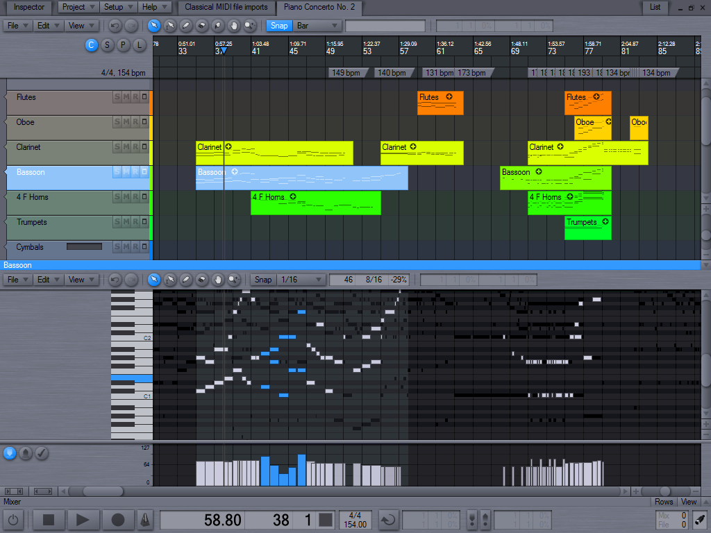
February 4, 2008 at 14:00 #11688ZynewaveKeymasterIt looks like 1.98 is going to be a UI update. While working on the toolbar menus I had a few ideas for further refinements. There is now a “timeline fill” and “timeline text” color definitions in the Colors setup dialog. This allows setting e.g. a darker color nuance for the timeline area, which I think is nice. The screenshot below also shows the colors which I plan to use as the new default color scheme. A touch of blue instead of the old grey shade, and black text instead of white.
 February 4, 2008 at 16:31 #11689ConquistadorParticipant
Nice timeline idea. 🙂
Sometimes the smallest adjustments can make the biggest difference.
February 5, 2008 at 04:54 #11697 koolkeysParticipant
Wow, very sleek Fritz. Nice job! I can’t wait to try the new enhancements!
Brent
February 5, 2008 at 11:37 #11704 Igr0Participant
It’s really nice!
February 5, 2008 at 11:42 #11706 RejectParticipant
I have two say: two thumbs up!
February 5, 2008 at 12:15 #11707Igr0ParticipantOnly thing it’s no good, that midi and audio clips are TOO agressive ( especially yellow and green) IMO
February 5, 2008 at 12:23 #11709ConquistadorParticipant@Igr0 wrote:
Only thing it’s no good, that midi and audio clips are TOO agressive ( especially yellow and green) IMO
Maybe they do look a bit ‘bright’ perhaps less saturation will help or some other adjustment but I guess a user can easily change this. The current look of some of those tracks might even get them to check out the new colour options 😛
I do like the gradual colour change effect in the screenshot for the tracks.
February 5, 2008 at 17:22 #11722 thcilnnahojParticipant
Seems to me you’re going a different direction design-wise than when I started to use Podium. But then again… At that time, the UI already was quite some years old and probably merits an overhaul. I still prefer the radial faders (?) to the horizontal ones, and likewise with the new menu buttons. Well, it’s okay. Only I really don’t like those floating Project/Setup/Help buttons. 😕 (I hope the toolbar buttons will be sizable like the edit mode buttons?)
Now– the timeline-color-stuff, on the other hand, I fully approve of! 8)
Lastly, though unlikely for me to use, I like those neon colored tracks in the new def. theme! Certainly would give me a nice first impression.
- You must be logged in to reply to this topic.