Topic: Preview 2.05: Track header and inspector improvements
- This topic has 72 replies, 18 voices, and was last updated 17 years, 10 months ago by
 bladerunner.
-
August 21, 2008 at 15:32 #1680
 ZynewaveKeymaster
I’d appreciate your opinions on this.
Continuing from the 2.04 development, I’m migrating some of the new mixer features to the track headers and the inspector.
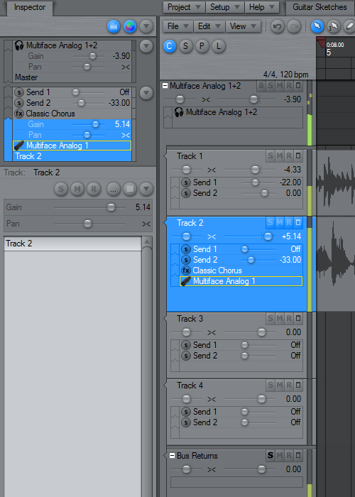
The track header meters now show RMS meters similar to the mixer. The meters can be configured as either horizontal or vertical meters. I’m now using the vertical mode as default. The horizontal meters left little room for the track name.
The BRXE buttons shown in the inspector group panel and the chain panels are now optional. Instead shift/alt/ctrl + clicking the device name will behave like the new 2.04 mixer defaults. Colored frames are drawn around the device names to indicate bypass, edit and record state. The buttons were perhaps more accessible than modifier+clicking, but the buttons occupied a lot of screen space. Anybody still prefer the old button style?
I was never happy with the old track header pan/gain faders. They were a bit “heavy”, and seen from a distance the track headers would blur together. The new fader style I’m trying here stands out better, and they have the glass-look also used for the mixer faders.
I’ve extended the fader/dial option to apply to all dials, and not only the track header pan/gain faders. How would you prefer to configure this: Should it be a “show faders instead of dials” option in preferences which then applies to the entire UI, or should it be multiple local options in the tracks region properties and the inspector properties etc.?
August 21, 2008 at 15:57 #13059 ConquistadorParticipant
@Zynewave wrote:
I’d appreciate your opinions on this.
Continuing from the 2.04 development, I’m migrating some of the new mixer features to the track headers and the inspector. The track header meters now show RMS meters similar to the mixer.
Super duper 🙂 Yes!
The meters can be configured as either horizontal or vertical meters. I’m now using the vertical mode as default. The horizontal meters left little room for the track name.
Fantastic.
The BRXE buttons shown in the inspector and the chain panels are now optional. Instead shift/alt/ctrl + clicking the device name will behave like the new 2.04 mixer defaults.
Hmm I don’t think bypassing an FX should be strictly a Modifier key affair. I would prefer not adding this option (bypass) to a right click menu but it needs to be accessible at track level…so really as we can already move and delete tracks with a right click command if you remove the x button there should be an easy way to get the functionality back IMO. A modifier key for simple bypass adds complexitiy where there was ease.
How about click and hold to bypass a device?
I suppose having a bounce command on a right click menu is probably OK but I don’t think having it on a track was such a bad thing it was far easier to access but the E is less important now, but X remains very important. R is still easily acessible at track level.
Colored frames are drawn around the device names to indicate bypass, edit and record state. The buttons were perhaps more accessible than modifier+clicking, but the buttons occupied a lot of screen space. Anybody still prefer the old button style?
I *really* like the coloured frames around the device names but if the old buttons can be made optional (which I think they are)I think that is OK.
I was never happy with the old track header pan/gain faders. They were a bit “heavy”, and seen from a distance the track headers would blur together. The new fader style I’m trying here stands out better, and they have the glass-look also used for the mixer faders.
I like the new look. I have always been a fan of the glass faders look. I am just trying to decide if I like my glass squared or circular 😆
I’ve extended the fader/dial option to apply to all dials, and not only the track header pan/gain faders. How would you prefer to configure this: Should it be a “show faders instead of dials” option in preferences which then applies to the entire UI, or should it be multiple local options in the tracks region properties and the inspector properties etc.?
Preferences IMO. I would want to set and forget it from there.
August 21, 2008 at 16:29 #13060 acousmodParticipant
The meters can be configured as either horizontal or vertical meters. I’m now using the vertical mode as default. The horizontal meters left little room for the track name.
Very good point.
The BRXE buttons shown in the inspector group panel and the chain panels are now optional.
All I hope is that they will remain available. For me the availability of theses buttons in the track headers is essential.
I was never happy with the old track header pan/gain faders. They were a bit “heavy”, and seen from a distance the track headers would blur together. The new fader style I’m trying here stands out better, and they have the glass-look also used for the mixer faders.
Sorry, I prefer the old ones 😉
I don’t find the drop look convenient with the rest of the GUI style.August 21, 2008 at 16:50 #13061 UncleAgeParticipant
@Zynewave wrote:
The track header meters now show RMS meters similar to the mixer.
Is that with the Peaks holding as shown in the picture on the Master track?
The meters can be configured as either horizontal or vertical meters. I’m now using the vertical mode as default. The horizontal meters left little room for the track name.
Looks a little nicer vertically. Provides a nice visual divider between the track and arrangement area. I like it. Once I have my levels set on input I rarely look back at these meters so I’m definitely ok with it like this.
The BRXE buttons shown in the inspector group panel and the chain panels are now optional. Instead shift/alt/ctrl + clicking the device name will behave like the new 2.04 mixer defaults. Colored frames are drawn around the device names to indicate bypass, edit and record state. The buttons were perhaps more accessible than modifier+clicking, but the buttons occupied a lot of screen space. Anybody still prefer the old button style?
For me the “E” button does not fit the “state” scenario. Bypass & Record are states and I don’t have a problem Shift + clicking here. As a matter of fact I would think that only one modifier key would be needed. And this way a user would just circle through the different states. However, I think Edit is a different beast. My opinion on this is that simply clicking or double-clicking on the name of the effect should bring up the editor.
I was never happy with the old track header pan/gain faders. They were a bit “heavy”, and seen from a distance the track headers would blur together. The new fader style I’m trying here stands out better, and they have the glass-look also used for the mixer faders.
Sounds/Looks good.
I’ve extended the fader/dial option to apply to all dials, and not only the track header pan/gain faders. How would you prefer to configure this: Should it be a “show faders instead of dials” option in preferences which then applies to the entire UI, or should it be multiple local options in the tracks region properties and the inspector properties etc.?
I would think a global option would suffice here. But I won’t be offended if additional options were offered.
What I do mind is having to wade through giant menu’s that offer 15 variations on every theme/option/selection just to get to what I need. Reaper is looking this way nowadays and it drives me nuts. I don’t mind things sitting behind the scenes this way but sitting 80% of the options in a context sensitive menu is not what I find useful. 🙂
August 21, 2008 at 16:52 #13062UncleAgeParticipant@acousmod wrote:
Sorry, I prefer the old ones 😉
I don’t find the drop look convenient with the rest of the GUI style.They do look like little water drops don’t they. Hmmph 😆
August 21, 2008 at 17:38 #13063ZynewaveKeymaster@acousmod wrote:
I was never happy with the old track header pan/gain faders. They were a bit “heavy”, and seen from a distance the track headers would blur together. The new fader style I’m trying here stands out better, and they have the glass-look also used for the mixer faders.
Sorry, I prefer the old ones 😉
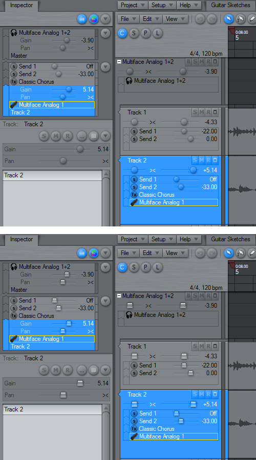
I don’t find the drop look convenient with the rest of the GUI style.You know, I think I agree that the glass look makes the faders appear a bit too alien from the other elements in the tracks region. I tried with solid round buttons instead, which I now much prefer. The squared glass buttons pictured below are just to satisfy Conquistadors curiosity 😉 :
 August 21, 2008 at 18:03 #13064ZynewaveKeymaster
@UncleAge wrote:
@Zynewave wrote:
The track header meters now show RMS meters similar to the mixer.
Is that with the Peaks holding as shown in the picture on the Master track?
The solid bar is the RMS meter. The two floating blocks are the peak meter. The top of the meter is 0dBFS, unlike in the mixer where it goes to +12dB.
The BRXE buttons shown in the inspector group panel and the chain panels are now optional. Instead shift/alt/ctrl + clicking the device name will behave like the new 2.04 mixer defaults. Colored frames are drawn around the device names to indicate bypass, edit and record state. The buttons were perhaps more accessible than modifier+clicking, but the buttons occupied a lot of screen space. Anybody still prefer the old button style?
For me the “E” button does not fit the “state” scenario. Bypass & Record are states and I don’t have a problem Shift + clicking here. As a matter of fact I would think that only one modifier key would be needed. And this way a user would just circle through the different states. However, I think Edit is a different beast. My opinion on this is that simply clicking or double-clicking on the name of the effect should bring up the editor.
Clicking a device name in the inspector or the header chain panels now is similar to the mixer 2.04 behaviour. Shift+click toggles bypass. Alt+click removes the mapping. Ctrl+click toggles record. Just clicking the plugin name will open/close the editor instead of showing the track menu as previously.
From the above posts I gather that the consensus is to show the X and B buttons by default, and only hide the E and R buttons. Note that the option to hide the R buttons does not include the R button on the track header title. It hides the plugin automation recording R buttons inside the chain panels.
Similar to my question about the dial/fader option: Should the options to show bypass, editor, bounce and record buttons be global options in Preferences or should it be possible to configure this individually for each editor?
August 21, 2008 at 19:53 #13065 SlomoParticipant
I’m not much for the new faders.
You have to look at two places. One for the “analog” placement on the scale and one for the “digital” value. The old one had value and placement in one. The less you have to hunt the screen the better in my opinion…That’s probably why options in preferences is a good thing. 🙂
August 21, 2008 at 21:26 #13066ZynewaveKeymaster@Slomo wrote:
I’m not much for the new faders.
You have to look at two places. One for the “analog” placement on the scale and one for the “digital” value. The old one had value and placement in one. The less you have to hunt the screen the better in my opinion…That’s probably why options in preferences is a good thing. 🙂
😥 I did not plan to make an option between the old vs. new faders.
My problem with the old fader style is that it can be visually confusing that the dB level readout is all over the place depending on where the fader knob is. With the new style it is easy to glance up/down the track list and trace the various dB levels. If you look at the fader design in other hosts, I believe it is rare to find examples where the value is written on the fader knob.
Another problem with the old fader style is that the visual design is not suited to be used for send faders. It’s either these new faders or back to the old faders with no fader option for the sends.
I’d appreciate more opinions on this.
August 21, 2008 at 22:05 #13067 swindusParticipant
I like the new faders more than the old ones, especially the send faders.
August 22, 2008 at 07:02 #13068acousmodParticipantIf you look at the fader design in other hosts, I believe it is rare to find examples where the value is written on the fader knob.
I agree with Slomo. It is what I found clever in your design : why waste some space when the same object can be used both for setting and showing the value ?
I suspect that the main reason for other hosts to separate the fader and the value is for looking like “real” gear ?
For me it was perfectly integrated in the GUI and even easier to read than your new design.Another problem with the old fader style is that the visual design is not suited to be used for send faders
I don’t understand why.
August 22, 2008 at 11:15 #13069 roninParticipant
I like the solid round buttons without the glass effect. they integrate pretty well with the rest of the ui. I’m not sure if I’m happy with the value displays.
Have you thought about solid faders with value? similar to the meters….just a rectangular area with a dragable “line” as fader. values could be printed into that area. the problem is that this one only works for horizontal faders.
hmmm just an idea.
August 22, 2008 at 11:22 #13070 H-manParticipant
@Zynewave wrote:
The track header meters now show RMS meters similar to the mixer. The meters can be configured as either horizontal or vertical meters. I’m now using the vertical mode as default.
Cool. Useful metering on each track header. Looks pretty good too IMO.
@Zynewave wrote:
Just clicking the plugin name will open/close the editor instead of showing the track menu as previously.
Yep. Love this feature. Apply it everywhere 😀
@Zynewave wrote:
I was never happy with the old track header pan/gain faders. They were a bit “heavy”, and seen from a distance the track headers would blur together. The new fader style I’m trying here stands out better, and they have the glass-look also used for the mixer faders.
Agreed. I really like the glass handles on the mixer faders, especially the effect where it appears that the handle is just magnifying the scale underneath as it passes over it.
I would assert that all faders should be the same shape, that way when the user sees that control, they immediately know what to do. Adds to the intuitiveness of the UI.
For the record I quite like CQSD’s glass rectangular(-ish) fader handles. Using the above principle ….buttons are always round, sliders are always rectangular(-ish. They are trapezoids right?).
@Zynewave wrote:
You know, I think I agree that the glass look makes the faders appear a bit too alien from the other elements in the tracks region.
Nah …they look good! It’d be nice if they refracted the track colour as well.
@Zynewave wrote:
Another problem with the old fader style is that the visual design is not suited to be used for send faders. It’s either these new faders or back to the old faders with no fader option for the sends.
So drastic! Could the fader handles be widened a little to allow room for the data on the handle. Like some of the others I always thought this was one of the many defining features of the Podium UI. I get it that this effectively moves the values back and forth but I would put it to you that 99% of the time you would be looking at the value on the handle because you are about to change it, and it is more convenient to have the value on the handle for that operation.
I would even suffer a smaller font on the handle if necessary. 😉
@Zynewave wrote:
From the above posts I gather that the consensus is to show the X and B buttons by default, and only hide the E and R buttons. Note that the option to hide the R buttons does not include the R button on the track header title. It hides the plugin automation recording R buttons inside the chain panels.
Please no default hide for the R, B, X, S, M buttons on the track header Frits. Consider those of us using a control surface on a small desk, you have to move the keyboard out of the way which leaves a mouse and the MMC controls on the BCF, or MPD or whatever.
August 22, 2008 at 16:08 #13071 kingtubbyParticipant
Just to add my preference in the faders debate. I’m not keen on the round ‘glass’ type, but I do like either the ‘solid’ round or ‘glass’ square options.
Mart.
August 22, 2008 at 16:26 #13073 cacoParticipant
@ronin wrote:
I like the solid round buttons without the glass effect. they integrate pretty well with the rest of the ui.
I agree, I like the new solid ones 🙂
@Zynewave wrote:
Just clicking the plugin name will open/close the editor instead of showing the track menu as previously.
Sounds great as i am forever doing this as an old habit 😉
@Zynewave wrote:
The track header meters now show RMS meters similar to the mixer. The meters can be configured as either horizontal or vertical meters. I’m now using the vertical mode as default.
It looks great, thanks Frits 8)
- You must be logged in to reply to this topic.