Topic: Preview 2.05: Track header and inspector improvements
- This topic has 72 replies, 18 voices, and was last updated 17 years, 10 months ago by
 bladerunner.
-
September 17, 2008 at 22:00 #13162
 ZynewaveKeymaster
@swindus wrote:
@Zynewave wrote:
I have now fixed this by making the plugin editor open/close occur on mouse release instead of on mouse down clicking. That way you can click and drag plugins. Please try it out in the new beta4.
Using a double click for opening a editor/menu in the mixer region properties does not work anymore.
Thanks. Double-fixed in beta5.
The new beta5 has options for selecting “readout sliders” (similar to those found in the mixer) for both the inspector group panel and the track headers. I’m considering using these in the default setup, so I would appreciate your opinion on the new readout sliders.
I think I’m done with adding new features for 2.05. If you don’t find any problems with this beta, I’ll probably release 2.05 this coming weekend.
September 18, 2008 at 00:02 #13163ZynewaveKeymaster@H-man wrote:
1. The first effect track applied to a bounce track doesn’t do anything (Cannot be heard). It seems to just become the bounce track? Any other effects added to the bounce track work normally.
Also, right-click to delete the effect track only shows the option to “Delete Bounce Track”
I’m planning to revise the bounce track system in the next 2.06 release.
3. With a dark panel background, a light coloured strip appears under the top menu buttons momentarily when you hit Save all etc.
I don’t get that. Is it possible that you can grab a screenshot when it happens, and email it to me?
September 18, 2008 at 01:29 #13170 H-manParticipant
@Zynewave wrote:
@H-man wrote:
With a dark panel background, a light coloured strip appears under the top menu buttons momentarily when you hit Save all etc.
I don’t get that. Is it possible that you can grab a screenshot when it happens, and email it to me?
Perhaps try clicking on the Project tab (Project Name, not the tab that’s labled Project, don’t close the arrangement), click Project and Save all..
😕I’ll get a Screen-shot this evening (Lunchtime here 😀 )
Ben
September 18, 2008 at 04:08 #13171 UncleAgeParticipant
@Zynewave wrote:
The new beta5 has options for selecting “readout sliders” (similar to those found in the mixer) for both the inspector group panel and the track headers. I’m considering using these in the default setup, so I would appreciate your opinion on the new readout sliders.
**Disclaimer: This is not a feature that I think I will use**
Now with that said, I do think the readout on the slider in round & square mode, is a little hard to read. I much prefer the readout to the right but if the option is there for users to see the readout on the slider it should [somehow?] be a little larger making it easier to read.
Now my concern is that the sliders would appear larger than they are right now if the text needs to be bigger. And I am a fan of the size of the sliders now. And I should add that I DO LIKE the readout on the sliders as well as the colored line [that extends below the slider] in the mixer section.
And I too would like to know what everyone else thinks about the readout on the sliders in the track-headers.
September 18, 2008 at 14:16 #13173H-manParticipantI think it works ….but only just.
I do agree that the sliders look good at their current size but the text is almost illegible. I have achieved what I think are better results by reducing the luminance of the sliders (-33 for example) which definately helps with reading the values on the Glass sliders.
To work as the default, I think the slider would have to be a little bigger (15%) and non-glass. First impressions and all that. Regular Podium users would settle into their preferences pretty quickly anyway.
I have spent some time with the different configurations and find them all very workable however I would still say that I prefer having the value on the slider.
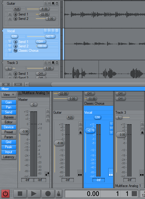
September 20, 2008 at 01:37 #13180ZynewaveKeymasterI agree that the tiny font used on the readout sliders are of little use when it’s hard to read. I’ve tried using a slightly larger font, as seen on the screenshot below. To be consistent with the track header sliders I’ve also added the missing dB decimal to the gain faders in the mixer strips.
Is this good enough to be the new default Podium setup?
 September 20, 2008 at 02:48 #13181H-manParticipant
That looks pretty good to me 😀
IMO this is fine/optimal for when you’re noodling and composing. If you have to do a couple of days worth of mixing then it may be preferable to change to one of the other settings.
Also, I would recommend a ‘Help pop-up’ explaining that the settings can be altered (This is still enabled by default for first-time install right?)
Ben
September 20, 2008 at 05:00 #13182UncleAgeParticipantI think it looks good as well. Most users start noodling around a bit after they get a little comfortable in an app. They’ll find a look that fits, I’m sure. In the meanwhile this default looks more than acceptable and remains useful and unique.
Good job Frits.
September 20, 2008 at 10:38 #13183 swindusParticipant
I would prefer rectangular sliders on the gain faders in the mixer, but overall it looks quite nice!
September 20, 2008 at 14:50 #13186 ConquistadorParticipant
@Zynewave wrote:
I agree that the tiny font used on the readout sliders are of little use when it’s hard to read. I’ve tried using a slightly larger font, as seen on the screenshot below. To be consistent with the track header sliders I’ve also added the missing dB decimal to the gain faders in the mixer strips.
Is this good enough to be the new default Podium setup?
I think that does look nice. The text was just a bit too small before but your adjustments I think would now make a nice default setting.
September 20, 2008 at 18:25 #13187 kingtubbyParticipant
@swindus wrote:
I would prefer rectangular sliders on the gain faders in the mixer…
Agreed – otherwise very nice 🙂
Mart.
September 20, 2008 at 19:49 #13189 roninParticipant
very nice! I really like the round sliders/faders. the screenshot looks very suitable as default layout.
September 21, 2008 at 00:44 #13197 bladerunnerParticipant
the oval sliders look great in my opinion. stylish, uniform and unique 🙂
- You must be logged in to reply to this topic.