Topic: Preview 2.05: Track header and inspector improvements
- This topic has 72 replies, 18 voices, and was last updated 17 years, 10 months ago by
 bladerunner.
-
August 29, 2008 at 05:48 #13105
 acousmodParticipant
And one question : how do we drag a plugin from one track to another one now ?
Same way as you’ve always done, unless you refer to the old expanded mode track header?
No, when I try to drag the name of the plugin from one track to another one like before the GUI opens (or closes), but it is not copied to the new track.
The same thing happens when I want to create a new track by dragging a plugin below the existing tracks. It doesn’t work anymore.August 29, 2008 at 07:10 #13107acousmodParticipantDesign : could the vertical bar at the right edge of the meters be set thinner ?
Future : do you think that you could (later) make meters showing all the available audio channels ? They could share the available space, and for more than 8, one pixel wide for each channel will be enough. If I remember well, it is how it is done in Nuendo.
August 29, 2008 at 12:57 #13110 H-manParticipant
@Zynewave wrote:
Added “slider knob visual style” combobox to the preferences dialog. Choices cover combinations of glass/solid, rectangular/round and with/without value readouts on the knob.
It’s fantastic! The Track headers look great.
@Zynewave wrote:
Another change is that the groove for the slider is filled with the parameter graduation colors (similar to the dial fills).
Again, looks great. Is this graphical feature going to be incorporated into the mixers strips as well?
@Zynewave wrote:
@acousmod wrote:
And one question : how do we drag a plugin from one track to another one now ?
Same way as you’ve always done, unless you refer to the old expanded mode track header?
Confirmed acousmod. The clipboard still works but the ability to drag-and-drop instruments/effects has disappeared.
I would expect that the ‘stub’ to the left of the instrument/effect could still be used for dragging-and-dropping.
I should say that despite my earlier post, I’m not really missing the values on the fader handles (on the Trak Headers) as much as I thought I would. 🙄
Pretty happy for the mixer to still keep this feature tho. 🙂
August 29, 2008 at 22:31 #13113 ConquistadorParticipant
@Zynewave wrote:
Another change is that the groove for the slider is filled with the parameter graduation colors (similar to the dial fills).
Nice. 🙂
August 31, 2008 at 22:44 #13124 ZynewaveKeymaster
I’m working on integrating the new slider style into the mixer. Below are three different layouts that show the different slider styles. Notice that the sends now also are sliders. The old dial layout can still be selected of course. The first screenshot also shows the new gain/pan value row which will appear when you deselect the “value on knob” option. My favorite layout is the first one. I think it’s a bit cleaner without the values being written all over the place, and it is easier to read the larger font. Which one do you prefer?
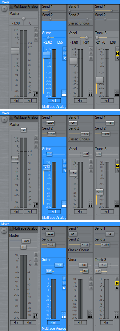 August 31, 2008 at 23:33 #13125H-manParticipant
Hi Frits, Pods,
A couple of things….
1. The coloured rectangles that indicate Record, Bypass, Editor open etc. are different sizes on the Group Panel compared to input assignments.
Try bypassing midi in and you’ll see what I mean.
2. Can the vertial meters on the Track Headers have assignable colour notches for the markers. A dark panel background results in not being able to see them.
3. I like the middle one (of course 😛 ).
BTW, where would the value for the sends appear for the top one (Option one)?
Ben
September 1, 2008 at 05:58 #13126 roninParticipant
Hmm I like all of them but I guess I would prefer the third one. Unfortunately I don’t like small gain fader/dial. Is it possible to combine the faders from your first example with the pan/sends from the last one?
Maybe it is a good idea to use the same styling for all UI elements, for example round faders with round send/pan etc. Although I like the tidiness of the first example how about a round fader between the meter channels?
September 1, 2008 at 06:32 #13127 koolkeysParticipant
I prefer number 2. I actually like the small balls on the sends, but if you want consistency, then I pick number 2. I do NOT like number 3 because I don’t like my level meters on a separate plane than the actual level meters area.
Brent
September 1, 2008 at 10:23 #13128ConquistadorParticipantMy choice…? No. 2 easily for me.
Problems with no. 1
The send buttons look far too small compared to the glass send buttons with the values on them in screenshot 2. The glass buttons provide a larger hitpoint for the cursor, look more stylish and IMO are simply more practical and easier to use IMO.Also the design of the faders in screenshot 1, lose that critical value display and look a bit odd to me. Sorry.
Problems with No. 3.
Similar functionality (values on buttons) as no.2 but they look too ordinary and not as stylish as no. 2.Screenshot No. 2 is defintely my first choice of the three.
I would say No. 3 would follow that.
September 1, 2008 at 10:31 #13129 BioEncoderParticipant
My choice is No.2 without the gloss effect (like No.3)
September 1, 2008 at 11:13 #13130ConquistadorParticipantWidth of Vertical Meters:
I think Acousmod suggested thinner vertical meters…well to be honest I really don’t think there is much room for change there. 😐Any thinnner than it is now and it might be very difficult to see the indicator lines (at -6dB, -12dB and -24dB) even now they are not that easy to make out. A thinner vertical meter might make them less than practical for any real use.
H- Mans idea for “assignable colour notches” for the indicator lines, a few posts above this one (which I agree with) somewhat highlights how difficult it can be to see them even now.
Of course an option could be added here anyway for the width of the vertical meters, but my inital thought is to keep the width of the vertical meters *as is* personally.
On another note…
Frits…you had a groovy idea…:P
I noticed that the colours used for the groove in the sliders in your screenshots do not really show case how clever this idea of yours really is…
@Zynewave wrote:Another change is that the groove for the slider is filled with the parameter graduation colors (similar to the dial fills).
An example: Send 1 for the Guitar track in Screen shot 2 has a value of -22.00 now there should be some kind of change in the colour here.
Going all the way up to +1.12 on Send 2 for the Vocal track and again the same colour.
I used this setting…

…to get a very nice change in colour as I move the slider. Maybe a similar default setting would make this particular feature stand out much more. This setting also works very well with *any* kind of dial in Podium, Sends, zReverb, zPeq e.t.c please try it.
It provides a nice visual indicator for lower, mid or high values.
September 1, 2008 at 11:46 #13131H-manParticipant@Conquistador wrote:
….The glass buttons provide a larger hitpoint for the cursor…
hahahahah 😆 So true! Especially if you’re a ‘bad shot’ like me 😳
@Conquistador wrote:
I used this setting…
…to get a very nice change in colour as I move the slider. Maybe a similar default setting would make this particular feature stand out much more. This setting also works very well with *any* kind of dial in Podium, Sends, zReverb, zPeq e.t.c please try it.
It provides a nice visual indicator for lower, mid or high values.
Nice tip CQSD 💡 8) 💡
@ronin wrote:
Maybe it is a good idea to use the same styling for all UI elements, for example round faders with round send/pan etc. Although I like the tidiness of the first example how about a round fader between the meter channels?
I agree. Currently with Beta 2 choosing Slider knob visual style from the preferences menu gives you round(-ish) knobs for gain and pan on the mixer strips and it does look pretty cool.[/quote]
September 1, 2008 at 14:28 #13132 UncleAgeParticipant
Currently I think “Glass Round” selected in preferences looks best in the mixer in the Beta2. (And I can’t figure out the difference between “Glass Round” and “Glass Round Values”, but that’s neither here nor there at the moment.)
However, I have to agree with Frits, example 1 looks better than the rest. It cleaner and easier on the eyes to me.
As of right now, in Beta2 with Glass Round selected the sends have dials in the mixer section. And when the value is changed the word “Send” dissapears and the value of the send is displayed. As long as that was the continued behavior when adjusting the sliders for the sends I could live with it.
However, my suggestion(if you go with the first example), is to just put the value of the slider directly to the right of the word “Send”. And again there could be a couple problems here. One is that I am not sure much is gained if the value is right next to the word versus displaying the value on the slider itself. The second is that instead of the send taking up 1 line of space on the mixer channel it will now take up 2 spaecs (Line 1 for the word “Send” and possibly the value and line 2 for the actual slider).
And with all that said I still like the “Look” of the first example Frits posted. The question is how to get it to work seamlessly with the rest of the UI.
September 1, 2008 at 15:31 #13133ZynewaveKeymaster@UncleAge wrote:
As of right now, in Beta2 with Glass Round selected the sends have dials in the mixer section. And when the value is changed the word “Send” dissapears and the value of the send is displayed. As long as that was the continued behavior when adjusting the sliders for the sends I could live with it.
That’s how I initially have implemented the send sliders, but I’m not happy with how it works. I’m about to try with a send value popup which will appear when the mouse is over the send slider/dial. Similar to how the mixer grid popup behaves, but only showing the send dB value.
The problem with showing the value on the device line (“Send1”, “Send2” etc.), is that the value may overlap the send name. If you’ve named a bus send “Reverb send” it would leave no space for the send value.
September 2, 2008 at 02:44 #13135ZynewaveKeymasterBeta3 is uploaded. This includes the mixer updates, as discussed above.
The slider setup has been moved from preferences to the colors dialog. There is a new “knob luminance offset” setting that enables you to create a larger contrast between the knob and the background. Typically you would set a negative offset with bright colorschemes and a positive offset with dark colorschemes.
There are also some new options in the mixer region properties dialog.
- You must be logged in to reply to this topic.