Zynewave's Forum Page
Forum Replies Created
-
 ZynewaveKeymaster
Beta10:
Some bug fixes (not all bugs are fixed yet).
The track lane header now uses the same focus frame as the mixer strip.
Adjusted the shadow effect on the slider grooves.
ZynewaveKeymaster@thcilnnahoj wrote:
A few quick comments before I go to bed:
Thanks for the feedback.
– Tiny selectors on track headers, hmm… I haven’t found a device with a name that takes more than half of the available space. Also the lack of bypass buttons – there’s more than enough room, I think. Like this, the only way for newcomers trying Podium for the first time (meaning no knowledge of keyboard shortcuts or mixer options) using the default setup to bypass a plug-in is in the rack panel. But maybe this is just a far-fetched example.
Yes, that was a mistake. The bypass buttons are now shown on the track headers. I also noticed a bug that has appeared in beta9, causing the entire selector to be colored as bypassed, even when a separate bypass button is shown. That is now fixed.
– The whole upper half of horizontal fader grooves is drowned in shadows, making it unnecessarily hard to see the coloring, which is such a nice feature. 🙁
– I like the non-shadowy look of the vertical fader grooves, but as I said before it looks blurry on dark background. I also wouldn’t mind them being even a little wider still.The shadows are drawn using the same algorithm that is used for all shadows in Podium: The lighting comes from above (slightly to the left), so the horizontal grooves will be naturally darker than the vertical ones. I’ll see if I can twist reality a bit.
Here’s another way to display bypass buttons I believe worth mentioning (used in Fabfilter plug-ins). The control’s not (just) a selector like in Podium, but the principle can be applied to those as well. Just disregard the level bar, +/- and X buttons on the sides.

1. Control in its normal state. (If you move the mouse on it you can adjust the level)
2. Mouse hovering over left edge of control – it turns into a little power button.
3. Control in bypassed state, without the mouse hovering over it.Podium’s bypass X button could, for example, appear as soon as the mouse cursor is moved anywhere on a selector button, like saying “Hi! If you want to bypass this thing, I’m over here. Otherwise just click anywhere else to open the editor.”
Unfortunately this behaviour is not very “touch screen” friendly. I’m not saying I’m going to change the entire Podium UI to focus on touch screen support, but I do think that touch screen operation will become more prominent in the future. So I keep that in mind when I design UI behaviour. Pressing on a touch screen will perform a click, and so you don’t have the usual mouse cursor you can move over controls to reveal more options.
ZynewaveKeymaster@Conquistador wrote:
I’m sorry, but this post does not make sense to me.
Ok…I think this discussion is sadly starting to slide a bit. You seem offended by my choice of words…”step backward” and feel the need to defend yourself… no need.
I made the comparison with other host mixers, just to verify that hiding the bypass buttons by default would not be a catastrophic decision. If Logic Pro users can live without bypass buttons, then I feel confident that it is ok to have the bypass buttons hidden by default.
Make the comparisions you want with other hosts we all do, I just think the comparison was and is strange but don’t take my comments so personally.
Saying that this is “Taking a step back in functionality” is overreacting.
But you saying “Catastrophic” is not?
That is hardly the way I described it now is it?. Look a simple difference in opinion should not offend you. Its impossible for everyone to agree about everything all the time. No need to get upset. Really.
I’ll leave this exchange of words with you here, as I just wanted to share my views on this forum about Podium (which AFAICT has not been a problem until now), not upset you. If you do not understand them or agree thats fine by me but please try and accept that without getting upset. Its just too small an issue for that.
Peace. 😉
😯
Ok, apologies for apparently having offended you back. Let’s call this one “lost in translation”. After having mentioned the “show bypass buttons” option in three of my previous posts, I guess I was annoyed that you still claimed this was a step back in functionality. It’s just two mouse clicks to change the option, and the setting is remembered when you restart Podium.ZynewaveKeymasterBeta 9 is up. I don’t have a specific changelog. There are just too many changes to list. I’m going to have a hard time writing the release note for 2.23. Maybe I should just release it as Podium v3.0 😉
I have not spent much time on testing the new mixer, so please wait with bug-hunting until the following beta, after I have verified all my code changes. With beta 9 you should however be able to see how the new mixer works, and so I would appreciate any feedback you have on the layout and behaviour of the mixer.
ZynewaveKeymaster@Conquistador wrote:
@Zynewave wrote:
I had a quick look at some other host mixers: The Cubase mixer seems to use two lines for each effect; one for the name and a second line for assorted buttons, including a power button. The Logic Pro 9 mixer does not have bypass buttons, but uses option+click to toggle bypass. I don’t see any bypass buttons in the Reaper mixer strips either.
I would be very careful about looking elsewhere to see if something that was not a problem in Podium before 2.23, is mirrored elsewhere. Comparison has its merits but in this case Podium has a chance to offer easier access and functionality in this area (like it did pre 2.23) thats all.
Taking a step back in functionality IMO and effectively saying they have the same setup is a bit puzzling. I would have thought even a small opportunity to make Podium easier and more pleasurable to use would be snapped up.
. I wouldn’t call it a “step backward” just by having them hidden in the default setup 😉
Call it what you will… 😉
Step backward, a degree of added complication or simply a case of design / presentation over functionality…its a small part of the interface but one that is very important to access quickly and easily.
The reason I would like to have them hidden, is to provide more space for the effect name. A lot of plugins have long names which will be truncated in the narrow buttons on the mixer strips
FR alert…
That is easily solved by having mixer strips one can drag to the right and having the FX buttons resize accordingly. Otherwise we have the current situation where a bypass button is removed to make way for plugin text. A user should not have to trade one for the other. Mixer strips need to be wider by default or…dragging them should resize fx buttons which should as a result make more text visible. Solved.
A user will then be able to decide for themsleves how comfortable they are with a strips width versus the text they need to see on a button IMO.
I’m sorry, but this post does not make sense to me.
Saying that this is “Taking a step back in functionality” is overreacting. I’ve mentioned several times now that you just enable the “show bypass buttons” option, and then you have it the way you want.
I made the comparison with other host mixers, just to verify that hiding the bypass buttons by default would not be a catastrophic decision. If Logic Pro users can live without bypass buttons, then I feel confident that it is ok to have the bypass buttons hidden by default.
And the mixer strips can already be resized with the “minimum strip width” setting in the mixer region properties. As I’ve previously mentioned in this topic, I’m also going to add strip width zooming.
ZynewaveKeymaster@kyran wrote:
I just think that the ‘E’ button functionality can be put into the general fx slot (clicking the fx slot opens the editor)
It already is. There are no separate ‘E’ buttons.
I’ll release a new beta later today.
ZynewaveKeymaster@kyran wrote:
I use bypass all the time:
1. To see if the effect is actually improving the sound
2. I’ll have 5 different fx on a track and bypass/enable sets of them to see what actually works well and what does not
3. When I come back to a tune and I don’t remember what each sound actually does.I sometimes even automate those switches (I haven’t done that in podium yet though) because I’d like some fx only to present in certain parts of a tune.
But my workflow might not be so widespread ofcourse
Thanks for the workflow description.
I had a quick look at some other host mixers: The Cubase mixer seems to use two lines for each effect; one for the name and a second line for assorted buttons, including a power button. The Logic Pro 9 mixer does not have bypass buttons, but uses option+click to toggle bypass. I don’t see any bypass buttons in the Reaper mixer strips either.
I think having the “show bypass buttons” option satisfies most users. I wouldn’t call it a “step backward” just by having them hidden in the default setup 😉
The reason I would like to have them hidden, is to provide more space for the effect name. A lot of plugins have long names which will be truncated in the narrow buttons on the mixer strips.
ZynewaveKeymaster@Conquistador wrote:
@kyran wrote:
As it stands now there is no quick way to bypass an effect using the mixer view (if I’m seeing things correctly).
I think the current Shift+Left click should not be the default as a user would not immeadiately know that combo. Its too important IMO to have a user go through any click + button combo just to bypass a plugin every time. :-s
A step backward here IMO. I personally think functions like this need to be as accessible and as simple to use as possible. I dont’t think having a visible bypass button crowds the mixer look and feel in anyway. That kind of button is needed IMO. There is only so much that can be hidden before it becomes a negative instead of a positive.
Is it really that often that the average user will be bypassing individual effects? I often don’t use bypassing at all. Perhaps other users can post whether they think single-click bypass is essential?
As I said earlier, there is a “show bypass buttons” option in the mixer options menu. You also have the possibility to keep the bypass buttons hidden in the mixer, and use the bypass buttons in the inspector.
ZynewaveKeymaster@thcilnnahoj wrote:
@Zynewave wrote:
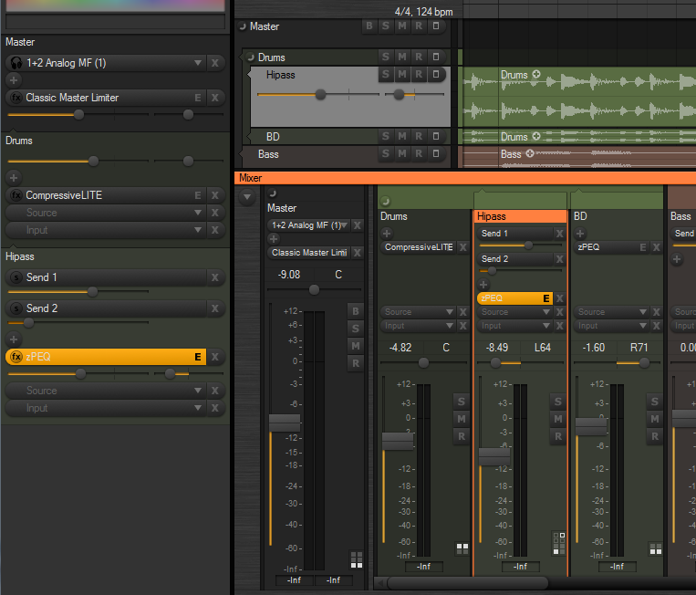
I plan to adjust the track lane headers before releasing 2.23. In fact I plan to experiment with changing the entire group bar hierarchy display in the tracks region, so that it matches the group header display used in the mixer. Try to imagine the mixer strips turned on the side. This means that the left edge of the track headers will no longer be offset horizontally according to their hierarchy position. This will ensure that e.g. all gain/pan sliders are aligned vertically, no matter what the hierarchy level the track is at. Any opinions on this?
I have a hard time picturing this. Wouldn’t it mean that all tracks moved more and more to the right, instead of only child tracks becoming indented, as the number of “group level strips” (for lack of a better word) increases?
Something like this?

Yes, something like that. Thanks for the mockup. There are pros and cons with that layout. One advantage (IMO) is that you get all controls/track names vertically aligned on all the tracks. Some may think that this improves the overview, while others may think the lack of indentation of the track names disrupts the overview. Personally I think indentation works well in for example a file folder list, but I often find it confusing that the track header controls are shifted around according to group level position. What do people think?
ZynewaveKeymaster@thcilnnahoj wrote:
@Zynewave wrote:
I’ve implemented a new “slider with value popup” control type, which I’m considering making the default, as shown in the screenshot. Moving the mouse over for example a send slider will show “Send: -3.20 dB” in a popup above the control. Often you don’t need the full decimal value indicated all the time. I think it helps clean up the UI.
While I agree that you’re better off not seeing numbers (and thus maybe mixing by them) all the time, I don’t understand why it would be better to have them (re)moved in the mixer. Since the faders’ numerical values are represented there at all times, they might as well be right next to or on top of the faders themselves. I see no need for separate fields dedicated to just this. That being said, it seems 9 out of 10 sequencers have been doing it this way all along, so there must be something I’m missing.
It’s just the new default setting. You can still enable the “slider with value on knob” option in the mixer region properties. This will apply to all send/gain/pan sliders. My goal has been a cleaner default look, and I think removing the values from the knobs achieves that. The gain/pan value text display uses a larger font, and thus is easier to read. It also provides for a single-click access to the value input in the track properties dialog.
I’ve tried adding some space between the strips (again), and drawing a frame around the selected strip, similar to the key focus frame drawn around list boxes. Eventually I would like to do the same with the track lane headers. Any opinions on this new style?
I think we’ve gotten to know the frame as just that – an indicator of which list receives keyboard focus in Podium. The actually selected item within the list would still be highlighted with a fully colored box (you can tell I don’t know UI design terminology!). In this case however, the mixer strip is the item… A little confusing, maybe, but I do like how it looks, so please continue. 🙂
And that’s the reason why I so far have colored the entire header/strip with the select color. But quite often it just doesn’t look good, especially with the new button style headers. I also found it annoying that you can’t see the track header update in realtime when using the color picker, as the header would always be painted with the select color.
It would also probably be good if the change over to ‘selection framing’ on the track headers would appear in 2.23 already, for consistency’s sake. Also, I wonder if you’re thinking of applying this to items in the arrangement too, seeing as they don’t have any visible controls that would suffer from being dyed.
I plan to adjust the track lane headers before releasing 2.23. In fact I plan to experiment with changing the entire group bar hierarchy display in the tracks region, so that it matches the group header display used in the mixer. Try to imagine the mixer strips turned on the side. This means that the left edge of the track headers will no longer be offset horizontally according to their hierarchy position. This will ensure that e.g. all gain/pan sliders are aligned vertically, no matter what the hierarchy level the track is at. Any opinions on this?
Other comments on the latest screenshot:
– Personally, I still prefer those faders shaped like pills (elongated beans? :D), with or without value display. The round ones seem so small, especially since the BSMREX buttons just got bigger.The slider can still be grabbed by clicking inside the entire slider frame, so it has not become harder to adjust the value. Having a smaller knob also means that the knob can travel a longer distance in the slider groove, resulting in greater precision.
ZynewaveKeymaster@LiquidProj3ct wrote:
@thcilnnahoj wrote:
@LiquidProj3ct wrote:
I should ask, without trying to be too perfectionist, why do you use a brighter colour in the top of each strip (‘Acoustic Guitar’ & ‘Chords’) and you don’t do it in ‘Track 3’ and ‘Master’?
Those tracks simply have no color assigned to them! 🙂
Uhmmm well, yes! But I wanted to mean that maybe the tracks that have a colour assigned shouldn’t have those bright colours on top of their strips. Just a matter of taste, nothing important 🙂
The bright color at the top in my screenshot is the actual color I selected for the track. If you don’t like bright colors, then just select darker color tones in the inspector color picker. I don’t like brightly colored tracks myself, but this screenshot was made as a quick test.
ZynewaveKeymasterI think I’m done with the mixer redesign:
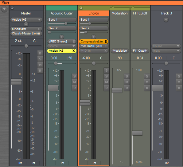
Notice that the bypass buttons are now hidden by default. They can still be enabled with the mixer options menu. Instead the input selector turns into a big bypass button when an input is assigned, the same way that plugin selectors turns into editor buttons. Shift+click can be used to toggle bypass of the source/effects.
There are still a lot of unfinished things that needs to be coded, so it will still be a couple of days before I have a new beta ready.
ZynewaveKeymaster@thcilnnahoj wrote:
@Zynewave wrote:
The colors setup dialog has been extended with settings for “rack/header/strip opacity” and “lane background opacity”. These settings have thus been removed from the tracks region dialog, as they are now applied globally. It also means that the rack, track headers and mixer strips will always have a consistent and similar look.
Aww, does that mean all three are linked? So we can’t have that nice full-colored background in the rack?
Give the new color options a chance. If you later on still feel a need to have full colored background in the rack, I can split up the opacity setting into separate settings for the rack, lane header and mixer strips.
ZynewaveKeymaster@LiquidProj3ct wrote:
@Zynewave wrote:
My screenshot was using the “compact strips” option, so that is why the meter widths are not as wide as usual. The meters will be the same width as in previous Podium releases, and in fact I plan to remove the “compact strips” option once I implement strip width zooming.
Anyway, even with normal strips, I think they’re very thin, that’s the reason I suggest a semitransparent slider. Just an opinion.
I’ll implement wider meters once I implement strip width zooming.
Another ‘taste’ opinion. I don’t find very appealing the fact that when you have the cursor over any Podium control is highlighted. Any chance to remove this feature or do it switchable?
As you can see for me the ‘solidity feeling’ when I do music is very important 😀
The “mouse over” highlighting helps indicate that a click will start a drag operation and not select the track. Consider the large area where you can grab the fader. If there were no highlighting here, you would often click this area thinking that it would select the track.
ZynewaveKeymasterLet me know what you think of this:
The chain panel buttons in the mixer can now be made smaller, by selecting the old “use small font” option in the mixer region properties.
The slider ‘groove’ is now bigger, so it’s easier to see the glow indicating the slider position/value.
I’ve implemented a new “slider with value popup” control type, which I’m considering making the default, as shown in the screenshot. Moving the mouse over for example a send slider will show “Send: -3.20 dB” in a popup above the control. Often you don’t need the full decimal value indicated all the time. I think it helps clean up the UI.
I’ve tried to find a way where a mixer strip can be shown as selected, without having the entire strip background painted with the select color. It can be quite overwhelming if you use a very bright select color. I’ve tried adding some space between the strips (again), and drawing a frame around the selected strip, similar to the key focus frame drawn around list boxes. Eventually I would like to do the same with the track lane headers. Any opinions on this new style?