Topic: Preview 2.23: Redesigned group panel
- This topic has 255 replies, 20 voices, and was last updated 16 years, 7 months ago by
 H-man.
-
November 12, 2009 at 12:11 #16727
 ConquistadorParticipant
@thcilnnahoj wrote:
I find the icon non-descriptive of its function (especially compared to the +/- button). Someone who didn’t already know might even think it’s supposed to be a small dial of sorts.
I agree 100%. 😉
But if there is a pop up that explains what it does I don’t think it will be a problem. The +/- button is more familiar to most users but I think in this case a bit of design flair from Frits here 😉 works very well and adds to the look and feel of Podium. Your right its not as obvious as the previous design but I think the additonal look and feel is worth the change and it can be easily explained on the UI with a pop up or similar IMO. 🙂
@ronin wrote:
Hmm I think the source & input buttons are too big..
Agreed. Not sure what the solution is but it does look like a case of a bit too much information being presented to a user. I would add both Source and Input to a right click menu possibly.
It could work the way it is now I guess. Not sure. :-k
November 12, 2009 at 12:42 #16728 LiquidProj3ctParticipant
@thcilnnahoj wrote:
I find the icon non-descriptive of its function (especially compared to the +/- button). Someone who didn’t already know might even think it’s supposed to be a small dial of sorts.
I like the new design, I must play with it before give any feedback although.
@ronin wrote:
Hmm I think the source & input buttons are too big..
Agreed. Not sure what the solution is but it does look like a case of a bit too much information being presented to a user. I would add both Source and Input to a right click menu possibly.
It could work the way it is now I guess. Not sure. :-k
I think that Frits are doing them big because he wants take advantage of the windows7’s touch screen tech…. just an suposition 🙂 I think he said in anywhere that he will do the interface resizable.
November 12, 2009 at 13:45 #16729ConquistadorParticipant@LiquidProj3ct wrote:
I think that Frits are doing them big because he wants take advantage of the windows7’s touch screen tech…. just an suposition 🙂 I think he said in anywhere that he will do the interface resizable.
Touch support…if that is the case then it makes more sense. The Source & input buttons are not terribly big as is but could be better sized or presented somehow, in any case laying the foundations for touch screen support perhaps gives some merit to the current design. But touch screens are far from being mainstream just yet so it may be better to favour the current tech we have.
In any case the design is consistent with other areas of Podium so it may not be so big a deal over time, but in a smaller space (the mixer) a right click (user configurable option) may be a good balance.
November 14, 2009 at 00:46 #16732 ZynewaveKeymaster
Let me know what you think of this:
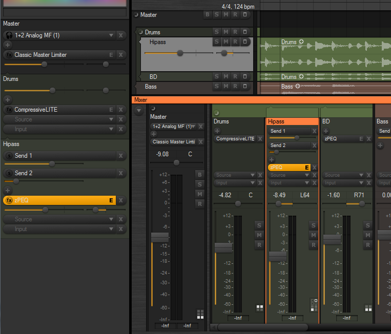
The chain panel buttons in the mixer can now be made smaller, by selecting the old “use small font” option in the mixer region properties.
The slider ‘groove’ is now bigger, so it’s easier to see the glow indicating the slider position/value.
I’ve implemented a new “slider with value popup” control type, which I’m considering making the default, as shown in the screenshot. Moving the mouse over for example a send slider will show “Send: -3.20 dB” in a popup above the control. Often you don’t need the full decimal value indicated all the time. I think it helps clean up the UI.
I’ve tried to find a way where a mixer strip can be shown as selected, without having the entire strip background painted with the select color. It can be quite overwhelming if you use a very bright select color. I’ve tried adding some space between the strips (again), and drawing a frame around the selected strip, similar to the key focus frame drawn around list boxes. Eventually I would like to do the same with the track lane headers. Any opinions on this new style?
November 14, 2009 at 00:59 #16733ZynewaveKeymaster@LiquidProj3ct wrote:
@Zynewave wrote:
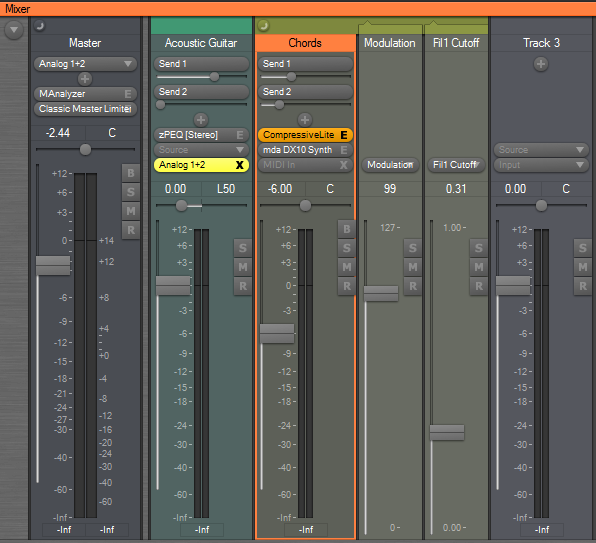
My screenshot was using the “compact strips” option, so that is why the meter widths are not as wide as usual. The meters will be the same width as in previous Podium releases, and in fact I plan to remove the “compact strips” option once I implement strip width zooming.
Anyway, even with normal strips, I think they’re very thin, that’s the reason I suggest a semitransparent slider. Just an opinion.
I’ll implement wider meters once I implement strip width zooming.
Another ‘taste’ opinion. I don’t find very appealing the fact that when you have the cursor over any Podium control is highlighted. Any chance to remove this feature or do it switchable?
As you can see for me the ‘solidity feeling’ when I do music is very important 😀
The “mouse over” highlighting helps indicate that a click will start a drag operation and not select the track. Consider the large area where you can grab the fader. If there were no highlighting here, you would often click this area thinking that it would select the track.
November 14, 2009 at 01:02 #16734ZynewaveKeymaster@thcilnnahoj wrote:
@Zynewave wrote:
The colors setup dialog has been extended with settings for “rack/header/strip opacity” and “lane background opacity”. These settings have thus been removed from the tracks region dialog, as they are now applied globally. It also means that the rack, track headers and mixer strips will always have a consistent and similar look.
Aww, does that mean all three are linked? So we can’t have that nice full-colored background in the rack?
Give the new color options a chance. If you later on still feel a need to have full colored background in the rack, I can split up the opacity setting into separate settings for the rack, lane header and mixer strips.
November 14, 2009 at 08:25 #16735LiquidProj3ctParticipantA-W-E-S-O-M-E
The new slider is ideal for me! I personally don’t like have to much numbers and letters in screen, because it clutters the host and my mind. So, really, they are awesome!!!
@Zynewave wrote:
I’ll implement wider meters once I implement strip width zooming.
Thanks you Frits 🙂
@Zynewave wrote:
The “mouse over” highlighting helps indicate that a click will start a drag operation and not select the track. Consider the large area where you can grab the fader. If there were no highlighting here, you would often click this area thinking that it would select the track.
I understand, although… have do yo think that select a strip/channel could be done clicking on fader too? I don’t find any problem if I select a channel clicking on the pan slider, or mute button. I really didn’t meditate this too much, but I find it could be a good idea.
I like a lot the new frame to show what channel is selected, because it does something that helps me to identify the channels. Allow me explain. I’ve some minor problems trying to find the name of the strip (such bass/drums/voice…) I usually tend to confuse them with the plugin is actually loaded in the track. Maybe you could do the name of strip more easily identifiable. You could center the name in the strip, or you could use another colour related with the strip’s colour. When you select the strip with this new frame, and you highlight the strip name, is something very cool. Maybe you could highlight the strip channel when it isn’t selected also.
Congrats by this new design, I’m eager to play with beta 🙂
Cheers!
November 14, 2009 at 11:46 #16736LiquidProj3ctParticipantI was playing recording some audio (beta8). Those marked fields are weird since they’re the same that parent layer, aren’t them?
 November 14, 2009 at 14:16 #16737
 MelodyManParticipantNovember 14, 2009 at 16:54 #16738
 kingtubbyParticipant
Looking good 🙂
I like the subtle colour variations – It’d be nice if when you select a track colour that any child tracks are automatically assigned a different but similar colour.
Mart.
November 15, 2009 at 12:29 #16739 H-manParticipant
I like the new style 🙂 . The wider groove for the slider(s) looks better too IMO.
As for the mixer I always thought that that frames used to highlight boxes in the inspector were quite effective and you are spot on about the “too much colour” problem. Using a frame allows for the use of a lot more colour variations.
One thing you may want to look at is when adding gain/pan controls (edit: on the group panel) to the top-most effect track, the sliders appear above the (+) Add new effect button ….seems wrong?
Also, would it be possible to have the inspector state (view/hide) remembered across the different tabs?
Ben
November 15, 2009 at 12:43 #16740H-manParticipantOh, forgot one thing,
Can we please get colour properties for the level markings on the meters (mixer and track headder)?
November 15, 2009 at 16:34 #16743LiquidProj3ctParticipantWhen I open a new project and new arragement I must follow these steps for a weird bug:


 November 16, 2009 at 02:03 #16744ZynewaveKeymaster
I think I’m done with the mixer redesign:
Notice that the bypass buttons are now hidden by default. They can still be enabled with the mixer options menu. Instead the input selector turns into a big bypass button when an input is assigned, the same way that plugin selectors turns into editor buttons. Shift+click can be used to toggle bypass of the source/effects.
There are still a lot of unfinished things that needs to be coded, so it will still be a couple of days before I have a new beta ready.
November 16, 2009 at 06:00 #16745LiquidProj3ctParticipantIt looks great 🙂
I should ask, without trying to be too perfectionist, why do you use a brighter colour in the top of each strip (‘Acoustic Guitar’ & ‘Chords’) and you don’t do it in ‘Track 3’ and ‘Master’? And, maybe the BSMR buttons must be moved two or three pixels towards left, allowing the orange frame be visible, unless your intention was that.
- You must be logged in to reply to this topic.