Topic: Preview 2.23: Redesigned group panel
- This topic has 255 replies, 20 voices, and was last updated 16 years, 7 months ago by
 H-man.
-
November 6, 2009 at 14:12 #16702
 ZynewaveKeymaster
Thanks for all the bug reports. I’ll get back to them soon. I’ve begun the redesign of the mixer. I wanted to make sure the chain panel code can be modeled to work on the mixer strips, before I start chasing bugs. I expect to have a beta with the first mixer changes ready this weekend.
November 10, 2009 at 18:13 #16711ZynewaveKeymaster@Zynewave wrote:
I expect to have a beta with the first mixer changes ready this weekend.
I ended up rewriting more than first planned, so I don’t quite have a beta ready yet. Here’s a screenshot of my progress so far:
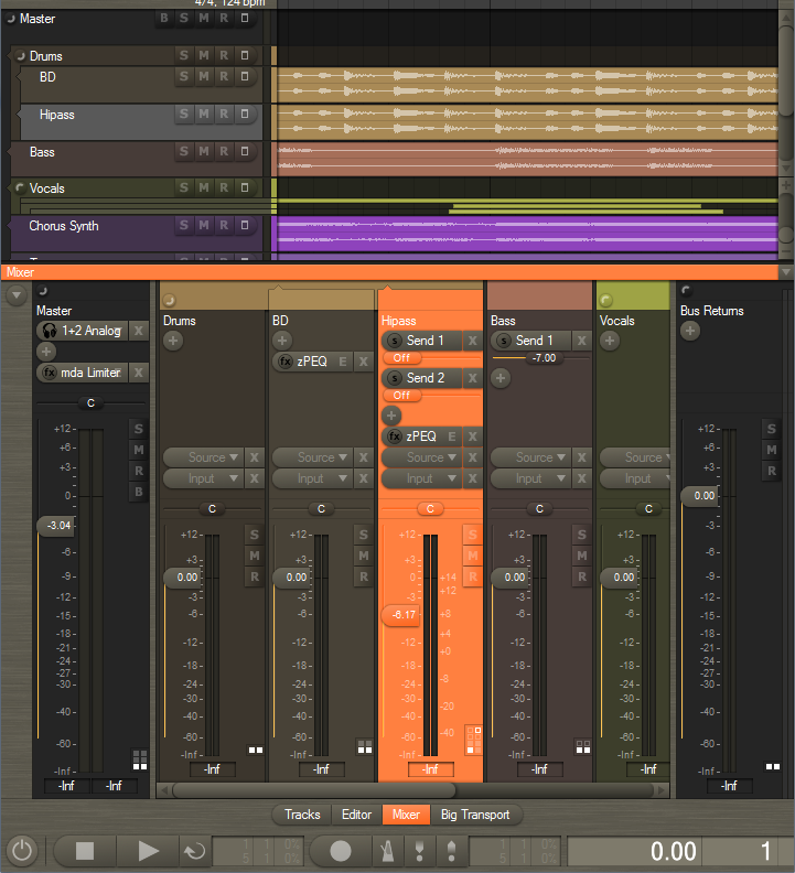
Please post your comments on the new design.
Notice the old +/- track group icons are replaced with new round buttons.
I am undecided whether the slider knobs in the mixer (and rack and track headers) should assume the color of the background, or if they should be the default button color. What would you prefer?
November 10, 2009 at 19:15 #16712 LiquidProj3ctParticipant
Thanks Frits, it seems nice… and thanks by full colour the mixer tracks! 😀
I think you must round the right side of mute buttons [X] also, since they will give more empty space between mixer strips.
I am undecided whether the slider knobs in the mixer (and rack and track headers) should assume the color of the background, or if they should be the default button color. What would you prefer?
I’d prefer see them with default button color, the same for pan slider, and maybe also BSMR buttons (tracks & mixer).
Best regards!
November 10, 2009 at 19:22 #16713 roninParticipant
Hmm I think the source & input buttons are too big…this is especially for the mixer. I think they are big in the rack too but thats probably a question of taste. I would prefer a smaller look. I love the new functionality of the rack but I was more into the old rectangular look (its a bit late for this but It took some time to test it).
November 10, 2009 at 19:30 #16714LiquidProj3ctParticipantcould be possible have wider meters? While the buttons are bigs, the width of meters seems too thin, so the strip interface is a little descompensated…
You could also drag a wider meter with a transparent slider on top, so you could keep mixer strip width.
November 10, 2009 at 20:08 #16715 Antal BodóczkiParticipant
Hi Fritz!
Integrating fixedly would be good the zynewave eq-t onto all of the channels of the mixer(as the inspector shows). The masterre too.Fix integrating:cubase,sonar,nuendo,dp,record.
November 10, 2009 at 20:18 #16716 thcilnnahojParticipant
Okay, here’s some early critique. 😉
– I see the SMR buttons are colored again… I got used to the ‘clean’ buttons in beta 8 and I’ve actually very much come to prefer it that way.
I’m still undecided on your question whether the faders should be colored or not.– Speaking of, the B button still comes after SMR in the mixer, directly opposite to where it is placed on the track headers – strange, I think. If you’re concerned about the B button pushing the SMR ones out of line across all mixer strips, then maybe just moving them down a bit would help?
I’m also yet undecided on the changed lighting angle of the SMR buttons in the mixer.– I was at first not very happy with the rounded side of the selector button plus the padding space to the left. I presume you decided on this because of the ‘+ effect’ button’s shape. However, I haven’t been able to come of with something I like better and that also retains more space. So, hats off to you. 🙂
The only thing I wonder about is how it would look if you kept the design used everywhere else (right-hand side X button also rounded) anyway and just widened the mixer strips by those 4 or 5 pixels needed.Also, tooltips for truncated device names would come in real handy about now… Since the device icons are in the mixer too, there’s even less space for the most important information. You can see the menu triangles being overlapped by the device names on the master strip, so text will probably have to be cut off even a little more.
– Will the different fader style options still be available or are you planning to clean up and unify the design?
Just saying… if this was a hardware design everybody would soon be complaining about broken-off fader heads! 😛– I find the half-circle button to be a little vague. In my opinion, it’s just not self-explanatory enough to realize what it’s supposed to do.
November 10, 2009 at 20:54 #16717ZynewaveKeymaster@LiquidProj3ct wrote:
Thanks Frits, it seems nice… and thanks by full colour the mixer tracks! 😀
The colors setup dialog has been extended with settings for “rack/header/strip opacity” and “lane background opacity”. These settings have thus been removed from the tracks region dialog, as they are now applied globally. It also means that the rack, track headers and mixer strips will always have a consistent and similar look.
I think you must round the right side of mute buttons [X] also, since they will give more empty space between mixer strips.
I’d like them to appear similar to and horizontally aligned with the BSMR buttons below. That’s why I made them square in the mixer.
November 10, 2009 at 21:01 #16718ZynewaveKeymaster@ronin wrote:
Hmm I think the source & input buttons are too big..
Do you mean the height of the controls, or the extra space used by the rounded edge?
I’m going to remove the object icons (‘fx’ etc.) shown in the mixer selectors, so that there are more room for the name of the object.
I also have plans for adding a strip width zoom button to the mixer left edge panel. Clicking this button will swap between two zoom settings. Dragging the button will adjust the width of the mixer strips.
November 10, 2009 at 21:04 #16719ZynewaveKeymaster@Tony Bodoczky wrote:
Hi Fritz!
Integrating fixedly would be good the zynewave eq-t onto all of the channels of the mixer(as the inspector shows). The masterre too.Fix integrating:cubase,sonar,nuendo,dp,record.
In a later release I will implement embedded plugin editors in the chain panel. This will be available in both the rack and the mixer strips. So you will be able to show for example a miniature zPEQ display with draggable curve handles embedded in each mixer strip.
November 10, 2009 at 21:08 #16720ZynewaveKeymaster@LiquidProj3ct wrote:
could be possible have wider meters? While the buttons are bigs, the width of meters seems too thin, so the strip interface is a little descompensated…
My screenshot was using the “compact strips” option, so that is why the meter widths are not as wide as usual. The meters will be the same width as in previous Podium releases, and in fact I plan to remove the “compact strips” option once I implement strip width zooming.
November 11, 2009 at 02:51 #16721ZynewaveKeymaster@thcilnnahoj wrote:
– I see the SMR buttons are colored again… I got used to the ‘clean’ buttons in beta 8 and I’ve actually very much come to prefer it that way.
Glad to hear it. It was just an experiment. I’ve reverted to the non-colorized buttons.
– Speaking of, the B button still comes after SMR in the mixer, directly opposite to where it is placed on the track headers – strange, I think. If you’re concerned about the B button pushing the SMR ones out of line across all mixer strips, then maybe just moving them down a bit would help?
I’ve now tried to put the B button at the top.
I’m also yet undecided on the changed lighting angle of the SMR buttons in the mixer.
Another experiment. I didn’t like it either, so I’ve now gone back to the horizontal bump.
– Will the different fader style options still be available or are you planning to clean up and unify the design?
Some of the old options will be removed, but I haven’t decided yet what options should be kept.
– I find the half-circle button to be a little vague. In my opinion, it’s just not self-explanatory enough to realize what it’s supposed to do.
Click on it a few times, and you soon realize what it does :wink:. It also has popup help.
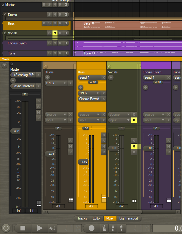
Below is a screenshot with the latest refinements. I’ve removed the 5-pixel shadow spacing between the strips. The strip separation is still good I think, now that the strips are colorized.
 November 11, 2009 at 05:05 #16722LiquidProj3ctParticipant
@Zynewave wrote:
My screenshot was using the “compact strips” option, so that is why the meter widths are not as wide as usual. The meters will be the same width as in previous Podium releases, and in fact I plan to remove the “compact strips” option once I implement strip width zooming.
Anyway, even with normal strips, I think they’re very thin, that’s the reason I suggest a semitransparent slider. Just an opinion.
Another ‘taste’ opinion. I don’t find very appealing the fact that when you have the cursor over any Podium control is highlighted. Any chance to remove this feature or do it switchable?
As you can see for me the ‘solidity feeling’ when I do music is very important 😀
November 11, 2009 at 13:11 #16725 kyranParticipant
I like the new circular buttons to expand/collapse tracks.
May I also do a suggestion:
Currently the track name is shown below the track header (that contains the expand/collapse button). However there is a lot of free space next to that button and the track name could easily be shown there. This will save vertical space, without making things look cluttered.
I also think it makes sense to show the name of a track in its header area.November 12, 2009 at 05:48 #16726thcilnnahojParticipant@Zynewave wrote:
The colors setup dialog has been extended with settings for “rack/header/strip opacity” and “lane background opacity”. These settings have thus been removed from the tracks region dialog, as they are now applied globally. It also means that the rack, track headers and mixer strips will always have a consistent and similar look.
Aww, does that mean all three are linked? So we can’t have that nice full-colored background in the rack?
– I find the half-circle button to be a little vague. In my opinion, it’s just not self-explanatory enough to realize what it’s supposed to do.
Click on it a few times, and you soon realize what it does :wink:. It also has popup help.
Well, something in a similar vein can be said about anything, really – even a hand grenade. 😛
As an interface designer, I’m sure you know what I meant to say. I find the icon non-descriptive of its function (especially compared to the +/- button). Someone who didn’t already know might even think it’s supposed to be a small dial of sorts.
If you don’t agree with this concern then let’s file it away as just another matter of taste.
- You must be logged in to reply to this topic.