Topic: Preview 2.23: Redesigned group panel
- This topic has 255 replies, 20 voices, and was last updated 16 years, 7 months ago by
 H-man.
-
October 16, 2009 at 02:50 #16524
 ZynewaveKeymaster
Beta2 is up. Another revision of the UI, and a few bug fixes.
@Zynewave wrote:
I considered a solution where an empty “
” box would always be placed at the bottom of the chain. Select an effect here, and a new empty effect track is automatically inserted at the bottom. But that means that there will always be two unused tracks in the chain (one in the master chain), and I think that takes up too much space. I changed my mind on this, and I have now added an “add effect” combobox at the bottom of the effect chain. Let me know if this is convenient or a nuisance.
I’ve incorporated some of the suggestions made in this topic, so hopefully the revised UI is now less caotical 😯
Tomorrow I’ll go through the posts in this topic and reply to questions.
 October 16, 2009 at 08:18 #16526
 kyranParticipant
Wouldn’t it make more sense to have the new effect slot at the end of the signal chain (where you’re most likely to add a new effect)?
October 16, 2009 at 08:32 #16527 roninParticipant
I like the idea of the “live-rack” too. Maybe this could be a separate panel in the inspector? With a select-box to choose which live-rack (one for each plugin and a global one where all track-vst-parameters can be mapped to the eight dials) is shown.
@Group Panel: To put it short: What do all these buttons do? I think some of them can be removed or integrated. I’ll try to give an example.
First there was an empty track 🙂 Gain and pan are set to the only valid position. To distinguish track gain/pan from the effect/send region stuff the panel should use some graphical elements like
fx inserts
fx inserts
. Gain and pan should be placed after/above that region (usually you want to use “insert effects” and control track gain/pan at the end of the chain). The group panel should look like this (probably with these region marks)****gain & pan****
fx inserts
***D/W dial – FX-chooser slot1***
fx inserts
***VSTi chooser***
***input device chooser***A D/W knob is a useful thing. The FX-chooser should be a combobox to select the different plugins (it looks already nice in the current screenshots). To show the state of the plugin it could use different colors (red – bypassed, green – editor open, yellow – solo, grey – default). The FX-chooser should have an item “no plugin”. Right-clicking the chooser opens a context menu which shows things like “Add Parameter -> VST ParameterList” and “Bounce” etc.
Drag & drop inserting/reordering should be available too (or these tasks have to be added to the context menu). Left clicking the “fx-name part” of the chooser opens the plugin editor. Left clicking the small triangle on the right (+ a few pixels 🙂 ) opens the menu where the device mappings/plugins can be selected. Maybe this should be two separate buttons which are “glued together” like it is possible with the new transport controls.And maybe thats all it needs.
I’m not sure about how the initial layout should look like. Somehow you have to add synth, fx and midi/audio input. Three initial/empty slots would probably clutter the layout…October 16, 2009 at 10:41 #16528kyranParticipantRonin made me think: is a seperate record arm button for each fx track needed. Can’t you just slave that to the group record arm button.
Is there a usecase where this useful? (I can’t see one at the moment, but I’m sure someone will tell me why this is useful) If not you could get rid of that button.Also with some tinkering I think the track select button can double as the E button. (although it might result in a more awkward workflow, and may not be worth it).
October 16, 2009 at 11:44 #16529 MarkusParticipant
Super cool! thanks man. Keeps going! i’m happy that you change that E button much closer on playlist! 8)
October 16, 2009 at 12:48 #16530 kingtubbyParticipant
I think the group panel selectors (highlighted) would look better recessed as there are too many floating elements, which doesn’t look great imo, particularly when the track is colourised.

Any chance of a user option on that?
Mart.
October 16, 2009 at 13:42 #16531MarkusParticipantOkay. This it how it should looks like.

Seriously. Source FIRST. Then fx list. Last we need sends. Those sends should be “balloon”. Just like those X, R, E buttons. It take less space, and its looks 10 times better. It’s not only me who want’s those “Balloons”.
EDIT
I made it more clearly now.

That “M baloon” is simple MIDI IN. Now whole view is CLEAR and EASY / FAST to discern. Does anyone else agree?!?!?
October 16, 2009 at 14:12 #16532roninParticipant@Markus wrote:
Does anyone else agree?!?!?
No. You won’t know where the sends are in the signal flow + you are switching the direction of the signal flow in your example. Podium uses almost everywhere “upwards” direction. In your proposal the signal flows downwards in the FX chain (where source and input are located too) and upwards in the track hierarchy…thats fairly confusing, sorry.
October 16, 2009 at 14:32 #16533MarkusParticipant@ronin wrote:
@Markus wrote:
Does anyone else agree?!?!?
No. You won’t know where the sends are in the signal flow + you are switching the direction of the signal flow in your example. Podium uses almost everywhere “upwards” direction. In your proposal the signal flows downwards in the FX chain (where source and input are located too) and upwards in the track hierarchy…thats fairly confusing, sorry.
well, we talk about this on vip lounge. Frits wants more customers and so on. Its not going to happen when podium learning level is so high. i’m just indicate things which make podium more easy to use.
October 16, 2009 at 14:59 #16534ZynewaveKeymaster@LiquidProj3ct wrote:
On the slot:
Left click in a empty slot for a instrument/effects menu
Left click in a busy slot for select it
Double left click show/hide the instrument/effect and select it
Right click menu with options/parametersThanks for the suggestion/reminder.
Beta3:
The selector buttons now turn into editor buttons once a plugin is assigned. That gets rid of the separate editor buttons. Good riddance, I say. When you alt+click the selector button, the effect is removed, and the effect selector menu reappears.
Also in beta3:
The default position of plugin editor windows are offset so that they don’t cover the track inspector.
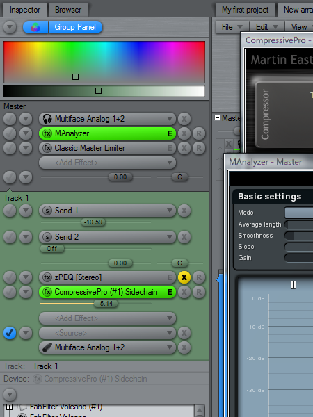
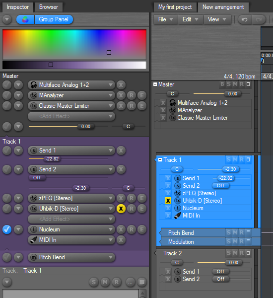
Perhaps this screenshot also illustrates why sends cannot simply be presented on a row outside the signal chain:
Sends in Podium are not placed at fixed positions in the signal chain, like they are in the mixers of some other hosts. The screenshot shows a sidechain input placed in the chain, and this also works as a send. If you took out the send controls from the chain and presented them on a row, then it would be difficult to know what the sends controlled.
The same thing applies to the gain/pan controls. They are also displayed at the position in the signal chain where the gain/pan is applied. If you enable gain/pan on more than one effect track, you’ll see multiple gain/pan controls in the chain.
All this follows the simple rule that all controls/buttons/sliders are placed in the chain in the order that the signal flows. From the bottom input to the topmost master output. Even though some users would prefer the instrument plugin to appear at the top, this would mean that the signal routing can no longer be seen as going in a straight line from bottom to top.
October 16, 2009 at 15:49 #16535kyranParticipantHere comes another suggestion to eliminate a button:
right clicking the track selection button could serve as a track mute. Right clicking a muted track could unmute it.
Left clicking still selects the track.I’d still like the empty track to be on top of the chain, where I most of the time add new tracks.
Also a way to drag drop reorder the tracks would be nice (use the track selector as a drag handle?)
October 16, 2009 at 17:23 #16536ZynewaveKeymaster@Markus wrote:
Now we have little mixer here. How about that orginal? Please remove those fx in there. Main purpose was get rid of that “scrolling up and down effect”.
The mixer will get a major revision later on. The updates to the track management in the latest Podium releases have left the mixer lacking in some areas. I want to complete the track management features before I start on the mixer redesign.
I also think that you should add there empty slots. Like 8 pieces. Example here
I don’t think that is necessary when we have the new “add effect” selector in the chain. You can use that to easily add any number of effects. No need to have a predefined number of empty slots.
October 16, 2009 at 17:34 #16537ZynewaveKeymaster@thcilnnahoj wrote:
Edit: Hmm, as I like to use bright track colors, I find the GP looking a bit strange now. Applying the track color to the controls (like on track headers) would make them more immedeately readable and would also make the shadows look less unnatural, too. Track colors might of course clash with selection/record/bypass colors, but shouldn’t that be the user’s responsibility? 😉

Hmm :-k , my current standpoint is that it can become too difficult to discern button select states, if the unselected buttons should assume the background color. If the source/input comboboxes are shown on a selected track header (in a future update), the color of the selector buttons would be the same selected as unselected.
October 16, 2009 at 18:32 #16538MarkusParticipant@Zynewave wrote:
The mixer will get a major revision later on. The updates to the track management in the latest Podium releases have left the mixer lacking in some areas. I want to complete the track management features before I start on the mixer redesign
Nice, thanks.
I don’t think that is necessary when we have the new “add effect” selector in the chain. You can use that to easily add any number of effects. No need to have a predefined number of empty slots.
Well that was just example. They way how it works now, its okay. Logic have similar style. Nothing wrong there.
You have done exelent job there. I hope you keep continue in this way.
How about coding just simple compressor / duck / gate fx? It doesnt have to be good. Just that good so we can use it for sidechain.
How long it will take to code something like this? Simple duck fx? Thanks for your time.
October 16, 2009 at 18:35 #16539 LiquidProj3ctParticipant
I’m just trying this. Thanks you Frits, this seems another thing. I was pretty scared when I see the aspect that Podium has with tons of buttons and fader. I know you work a lot and I didn’t want to offend your work in any way!! I’m more comfortable and I understand why the sends in Podium, so I’m gonna do you a suggestion. I hope you like it 🙂
➡ You could change mute button and do it a knob and then you should remove the send faders. This knob would be a Volume knob for instrument, a Dry/Wet knob for insert effects, and a Send Gain for send effects. If the knob is zero then the effect is bypassed. If you right click in the knob you alternate it between its original value and zero.
I think it has tons of common sense. Two controls in one + dry/wet feature request. All in the same knob = better workflow.
My best wishes for Podium 🙂 (at least Podium’s workflow ><)


- You must be logged in to reply to this topic.