Topic: Preview 2.23: Redesigned group panel
- This topic has 255 replies, 20 voices, and was last updated 16 years, 7 months ago by
 H-man.
-
October 14, 2009 at 15:48 #2055
 ZynewaveKeymaster
Besides the redesign of the group panel, the following is also implemented in beta1:
• Improved stability of plugin multiprocessing.
This involved a change to the way that the plugin processing is distributed to the available cores, so I would appreciate if you could try the beta1 and let me know if you notice any change for the worse in plugin CPU usage. Especially if you’re on XP. My XP machine is not running a multi-core CPU.
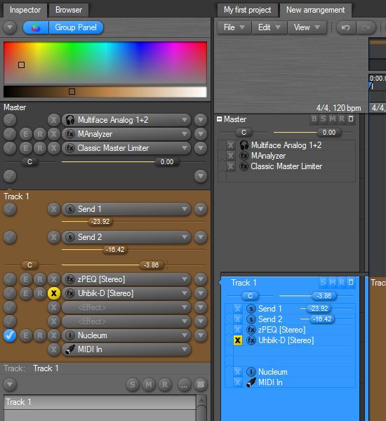
About the new group panel:
The old layout was a bit confusing, with all the different areas you could click to open different types of menus. The new layout uses regular buttons, so it should be less confusing what the mouse action will be. The layout is also cleaner, although somewhat larger than the old layout.
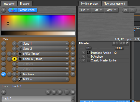
The first screenshot shows the default layout. The second screenshot has some of the control options disabled in the inspector menu, in case you only use the inspector for managing the effect chain, and use the mixer for setting gain, pan and send levels.
Post your opinions please.
If people like this change, I’m planning to make similar changes to the track headers, which also suffer from the click/menu confusion.
October 14, 2009 at 16:17 #16509 kyranParticipant
I haven’t tried this beta yet. I’m just going on the screenshots here (I’m still at work).
It looks like a major improvement, but I can’t really see a fast way of adding a new fx to the chain (except if there would be some drag and drop functionality with the browser).
Personally I’d like the inspector to be a mini mixer strip (like in ext2 and logic). A good meter view would turn your current design into this.
About the redesign of the track header: it is defenitely too cluttered at the moment, but I don’t think you should put this design on it. Currently the inspector, the mixer and the track header all show the same information. This is a lot of redundancy. The track header should be more minimal (I hardly have my track sizes so big that you can you can actually see any of the stuff it’s trying to show now).
The track header should just contain a custom name, the smrb buttons, and maybe pan and gain controls. If you want to know more, select it and have look in the inspector (that’s what the inspector is for right?)
A final remark: you’re stepping away from the integrated gui of the z plugins with the inspector then? Your current design doesn’t really leave room for these.
Sorry for the uncoherent ramblings. These are just my initial impressions based on the screenshots. I do think that in general this is a giant leap in the right direction.
October 14, 2009 at 17:12 #16510 LiquidProj3ctParticipant
Thanks Frits, i’ on multicore and XP, i’ll test this version.
@kyran wrote:
The track header should just contain a custom name, the smrb buttons, and maybe pan and gain controls. If you want to know more, select it and have look in the inspector (that’s what the inspector is for right?)
I totally agree. I’ve customized track headers that only show SMR name and generator. They were too clutered, before 2.23beta1 even. At least remove the most of it from the default setup.
October 14, 2009 at 17:34 #16511ZynewaveKeymasterIt looks like a major improvement, but I can’t really see a fast way of adding a new fx to the chain (except if there would be some drag and drop functionality with the browser).
If you click the right-most menu button, you get a “new effect track” command that will insert an empty slot. You can then select the effect from the effect selector combobox.
I considered a solution where an empty “
” box would always be placed at the bottom of the chain. Select an effect here, and a new empty effect track is automatically inserted at the bottom. But that means that there will always be two unused tracks in the chain (one in the master chain), and I think that takes up too much space. Personally I’d like the inspector to be a mini mixer strip (like in ext2 and logic). A good meter view would turn your current design into this.
A large meter in the inspector will come in a later release.
About the redesign of the track header: it is defenitely too cluttered at the moment, but I don’t think you should put this design on it. Currently the inspector, the mixer and the track header all show the same information. This is a lot of redundancy. The track header should be more minimal (I hardly have my track sizes so big that you can you can actually see any of the stuff it’s trying to show now).
The track header should just contain a custom name, the smrb buttons, and maybe pan and gain controls. If you want to know more, select it and have look in the inspector (that’s what the inspector is for right?)
I don’t intend to put the entire group panel on the track header. I plan to remove the display of the effect chain on the header, and just have the instrument and input comboboxes along with editor and bypass buttons. Optionally have the send, gain and pan sliders there as well.
I’ll also try to make the rectangular BSMR flat buttons into normal buttons, for consistency.
A final remark: you’re stepping away from the integrated gui of the z plugins with the inspector then? Your current design doesn’t really leave room for these.
In a later release I’ll remove the embedded plugin editor from the track panel, and instead insert it into the group panel, just below the combobox where the effect is selected. That will allow a zPEQ editor to be open when the source track is selected, and it also allows multiple embedded editors to be open at the same time. For this purpose, there will be a new button next to the current ‘E’ button, which will open/close the embedded editor.
Thanks for the input.
October 14, 2009 at 17:59 #16512LiquidProj3ctParticipantUgght 🙁
Sorry to say this. I’ve my best wishes for Podium, but I think this new interface for inspector is really ugly and unfriendly. I don’t want offend you in any way, but help as I can.
1. Why use a button for select slots? A simple left clic should be enough.
2. To cluttered! It’s caotical!
3. The most plugin has their own gain knob, or you can a simple plugin for that. You need use very very very few times, near zero, the gain and pan meter that you use in efects.We want do music, not develop a termonuclear car engine! 🙂
So, what do I suggest? Draw in paint it’s difficult so, excuse me the quality 🙂

On the slot:
Left click in a empty slot for a instrument/effects menu
Left click in a busy slot for select it
Double left click show/hide the instrument/effect and select it
Right click menu with options/parametersAllowed drag&drop, if the destination is a slot the efects should be exchanged. If the destination is a space between slots the efect should be erased from its original place and inserted in a new slot where the user dropped it. With shift/ctrl/alt the effect should be cloned/deleted.
The knob you see at the left of each slot is a dry/wet knob, it’s a little feature request 😉
You can adopt the same behavior for the mixer, where drag and drop effects is more important. Do it easy and inmediate please! 🙂
edit: I have to admit that I like more the second screenshot, I’d wish it has an inmediate and easy behaviour!
October 14, 2009 at 18:00 #16513ZynewaveKeymaster@Zynewave wrote:
A final remark: you’re stepping away from the integrated gui of the z plugins with the inspector then? Your current design doesn’t really leave room for these.
In a later release I’ll remove the embedded plugin editor from the track panel, and instead insert it into the group panel, just below the combobox where the effect is selected. That will allow a zPEQ editor to be open when the source track is selected, and it also allows multiple embedded editors to be open at the same time. For this purpose, there will be a new button next to the current ‘E’ button, which will open/close the embedded editor.
Which reminds me:
With plugin editors embedded in the group panel, would it not make sense to rename the “group panel” to “rack”?
I also plan to extend the current group panel options into perhaps 3 separate configs. That way you can quickly switch between different layouts, without having to toggle each individual option in the inspector menu. Instead of the “Group Panel” button at the top of the inspector, there would be buttons for “Rack 1”, “Rack 2” and “Rack 3”. Good idea, or overkill?
October 14, 2009 at 18:19 #16514 MarkusParticipant
Hey Frits
Looking good! Right way again! :D/
Now we have little mixer here. How about that orginal? Please remove those fx in there. Main purpose was get rid of that “scrolling up and down effect”.

I also think that you should add there empty slots. Like 8 pieces. Example here

How about put VSTi first, then fx slots. That is more logical, isn’t it?

And yes. Big meter!!

Edit; That E aka Editor view button should be under that “track menu button”. Please? it is more closer that playlist. Easier and faster to navigate.
October 14, 2009 at 18:57 #16515 thcilnnahojParticipant
First impression is favorable here. 🙂
Off the top of my head:
– Drag and drop would be very welcome. For dropping devices into the chain like you would on the track header, and also to drag-rearrange them (click and hold on the selector button?).– I think it will be more usable/less confusing without gain/pan faders directly inside the Group Panel. Maybe when the big meter comes around it could be accompanied by a little mixer strip with the mixing grid?
– Personally, I’d like it better if the track, and especially the device menus would open up directly below the buttons, like everywhere else in Podium, instead of to the right. I can see why it would cause some inconvenience, though.
Also, the menus appear in the wrong place when using a floating inspector/new inspector window. Plus the inspector window can be resized far too much! 😮

Edit: Hmm, as I like to use bright track colors, I find the GP looking a bit strange now. Applying the track color to the controls (like on track headers) would make them more immedeately readable and would also make the shadows look less unnatural, too. Track colors might of course clash with selection/record/bypass colors, but shouldn’t that be the user’s responsibility? 😉
 October 14, 2009 at 19:08 #16516thcilnnahojParticipant
@Zynewave wrote:
With plugin editors embedded in the group panel, would it not make sense to rename the “group panel” to “rack”?
I also plan to extend the current group panel options into perhaps 3 separate configs. That way you can quickly switch between different layouts, without having to toggle each individual option in the inspector menu. Instead of the “Group Panel” button at the top of the inspector, there would be buttons for “Rack 1”, “Rack 2” and “Rack 3”. Good idea, or overkill?
Maybe it’s a bit too much… I think grouping some options (E/R/X buttons, gain pan faders) would be fine, too.
October 14, 2009 at 20:18 #16517thcilnnahojParticipant@Zynewave wrote:
Besides the redesign of the group panel, the following is also implemented in beta1:
• Improved stability of plugin multiprocessing.
This involved a change to the way that the plugin processing is distributed to the available cores, so I would appreciate if you could try the beta1 and let me know if you notice any change for the worse in plugin CPU usage. Especially if you’re on XP. My XP machine is not running a multi-core CPU.
Okay, this may not be a very scientific test, but judging from the graphs in Windows task manager, CPU usage is more evenly distributed between my two cores in a CPU-munching project compared to 222. It seems I’m also getting a lot less red flashing in the CPU indicator at low latencies (Vista 32-bit). Could this be due to this change, or must there be something else at work? 😳
October 14, 2009 at 20:36 #16518MarkusParticipant@Zynewave wrote:
Besides the redesign of the group panel, the following is also implemented in beta1:
• Improved stability of plugin multiprocessing.
This involved a change to the way that the plugin processing is distributed to the available cores, so I would appreciate if you could try the beta1 and let me know if you notice any change for the worse in plugin CPU usage. Especially if you’re on XP. My XP machine is not running a multi-core CPU.
Here everything is okay. Win 7 32bit, intel quad 9550.
October 15, 2009 at 10:01 #16520kyranParticipant@Zynewave wrote:
@Zynewave wrote:
A final remark: you’re stepping away from the integrated gui of the z plugins with the inspector then? Your current design doesn’t really leave room for these.
In a later release I’ll remove the embedded plugin editor from the track panel, and instead insert it into the group panel, just below the combobox where the effect is selected. That will allow a zPEQ editor to be open when the source track is selected, and it also allows multiple embedded editors to be open at the same time. For this purpose, there will be a new button next to the current ‘E’ button, which will open/close the embedded editor.
Which reminds me:
With plugin editors embedded in the group panel, would it not make sense to rename the “group panel” to “rack”?
I also plan to extend the current group panel options into perhaps 3 separate configs. That way you can quickly switch between different layouts, without having to toggle each individual option in the inspector menu. Instead of the “Group Panel” button at the top of the inspector, there would be buttons for “Rack 1”, “Rack 2” and “Rack 3”. Good idea, or overkill?
I see. I think moving the embedded editors to the group panel is a good move. Renaming it to rack too.
The embedded editors are much handier now with this new layout, because it’s a lot more simple to select a certain track so it’s editor opens in the track panel.I don’t really get what you mean with those config options. A bit like the editor profiles?
What I’m missing now, after playing a bit with the new layout is a quick way to reorder the fx tracks. I’d really like to be able to do this with drag and drop. I think that this is quite essential.
The other panels feel quite redundant now, all their functionality is (much more intuitive) taken over by the group panel. I think you can remove those and gain quite some real estate in the inspector.
You could also gain real estate by changing the sends to knobs, instead of the current selector + fader + menu etc. These knobs could be placed next to each other as well.
Now here comes the wishfull thinking request: embedded editors for all vst’s. Each vst should have an embedded editor with 8 knobs (think racks in live). Like you have “add parameter track” option in the menu now, you could also have “link parameter to knob”, which will map that vst parameter to the knob, so you have it available for instant tweaking. You could also save this mapping in the plugin template so it’s restored each time you use it.
October 15, 2009 at 11:40 #16521 kingtubbyParticipant
@kyran wrote:
…Each vst should have an embedded editor with 8 knobs (think racks in live). Like you have “add parameter track” option in the menu now, you could also have “link parameter to knob”, which will map that vst parameter to the knob, so you have it available for instant tweaking. You could also save this mapping in the plugin template so it’s restored each time you use it.
Cool idea – I like it 😀
Mart.
October 15, 2009 at 12:27 #16522LiquidProj3ctParticipant@kingtubby wrote:
@kyran wrote:
…Each vst should have an embedded editor with 8 knobs (think racks in live). Like you have “add parameter track” option in the menu now, you could also have “link parameter to knob”, which will map that vst parameter to the knob, so you have it available for instant tweaking. You could also save this mapping in the plugin template so it’s restored each time you use it.
Cool idea – I like it 😀
Mart.I’m totally agree, i like the idea
October 15, 2009 at 16:54 #16523thcilnnahojParticipant@kyran wrote:
You could also gain real estate by changing the sends to knobs, instead of the current selector + fader + menu etc. These knobs could be placed next to each other as well.
It would save space showing a dial instead of the fader (edit: umm, in line with the send track’s buttons in the GP), but it wouldn’t necessarily mean they could be grouped in one place like in other sequencers. Sends can be put at any level in the signal chain.
@kyran wrote:
Now here comes the wishfull thinking request: embedded editors for all vst’s. Each vst should have an embedded editor with 8 knobs (think racks in live). Like you have “add parameter track” option in the menu now, you could also have “link parameter to knob”, which will map that vst parameter to the knob, so you have it available for instant tweaking. You could also save this mapping in the plugin template so it’s restored each time you use it.
That sounds a lot like this crazy idea from another thread… 🙂

(click) … Just a different place, and one editor at a time!


- You must be logged in to reply to this topic.