Zynewave's Forum Page
Forum Replies Created
-
 ZynewaveKeymaster
@LiquidProj3ct wrote:
@Zynewave wrote:
My screenshot was using the “compact strips” option, so that is why the meter widths are not as wide as usual. The meters will be the same width as in previous Podium releases, and in fact I plan to remove the “compact strips” option once I implement strip width zooming.
Anyway, even with normal strips, I think they’re very thin, that’s the reason I suggest a semitransparent slider. Just an opinion.
I’ll implement wider meters once I implement strip width zooming.
Another ‘taste’ opinion. I don’t find very appealing the fact that when you have the cursor over any Podium control is highlighted. Any chance to remove this feature or do it switchable?
As you can see for me the ‘solidity feeling’ when I do music is very important 😀
The “mouse over” highlighting helps indicate that a click will start a drag operation and not select the track. Consider the large area where you can grab the fader. If there were no highlighting here, you would often click this area thinking that it would select the track.
ZynewaveKeymasterLet me know what you think of this:
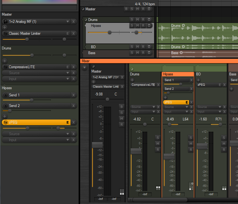
The chain panel buttons in the mixer can now be made smaller, by selecting the old “use small font” option in the mixer region properties.
The slider ‘groove’ is now bigger, so it’s easier to see the glow indicating the slider position/value.
I’ve implemented a new “slider with value popup” control type, which I’m considering making the default, as shown in the screenshot. Moving the mouse over for example a send slider will show “Send: -3.20 dB” in a popup above the control. Often you don’t need the full decimal value indicated all the time. I think it helps clean up the UI.
I’ve tried to find a way where a mixer strip can be shown as selected, without having the entire strip background painted with the select color. It can be quite overwhelming if you use a very bright select color. I’ve tried adding some space between the strips (again), and drawing a frame around the selected strip, similar to the key focus frame drawn around list boxes. Eventually I would like to do the same with the track lane headers. Any opinions on this new style?
ZynewaveKeymaster@thcilnnahoj wrote:
– I see the SMR buttons are colored again… I got used to the ‘clean’ buttons in beta 8 and I’ve actually very much come to prefer it that way.
Glad to hear it. It was just an experiment. I’ve reverted to the non-colorized buttons.
– Speaking of, the B button still comes after SMR in the mixer, directly opposite to where it is placed on the track headers – strange, I think. If you’re concerned about the B button pushing the SMR ones out of line across all mixer strips, then maybe just moving them down a bit would help?
I’ve now tried to put the B button at the top.
I’m also yet undecided on the changed lighting angle of the SMR buttons in the mixer.
Another experiment. I didn’t like it either, so I’ve now gone back to the horizontal bump.
– Will the different fader style options still be available or are you planning to clean up and unify the design?
Some of the old options will be removed, but I haven’t decided yet what options should be kept.
– I find the half-circle button to be a little vague. In my opinion, it’s just not self-explanatory enough to realize what it’s supposed to do.
Click on it a few times, and you soon realize what it does :wink:. It also has popup help.
Below is a screenshot with the latest refinements. I’ve removed the 5-pixel shadow spacing between the strips. The strip separation is still good I think, now that the strips are colorized.
 ZynewaveKeymaster
@LiquidProj3ct wrote:
could be possible have wider meters? While the buttons are bigs, the width of meters seems too thin, so the strip interface is a little descompensated…
My screenshot was using the “compact strips” option, so that is why the meter widths are not as wide as usual. The meters will be the same width as in previous Podium releases, and in fact I plan to remove the “compact strips” option once I implement strip width zooming.
ZynewaveKeymaster@Tony Bodoczky wrote:
Hi Fritz!
Integrating fixedly would be good the zynewave eq-t onto all of the channels of the mixer(as the inspector shows). The masterre too.Fix integrating:cubase,sonar,nuendo,dp,record.
In a later release I will implement embedded plugin editors in the chain panel. This will be available in both the rack and the mixer strips. So you will be able to show for example a miniature zPEQ display with draggable curve handles embedded in each mixer strip.
ZynewaveKeymaster@ronin wrote:
Hmm I think the source & input buttons are too big..
Do you mean the height of the controls, or the extra space used by the rounded edge?
I’m going to remove the object icons (‘fx’ etc.) shown in the mixer selectors, so that there are more room for the name of the object.
I also have plans for adding a strip width zoom button to the mixer left edge panel. Clicking this button will swap between two zoom settings. Dragging the button will adjust the width of the mixer strips.
ZynewaveKeymaster@LiquidProj3ct wrote:
Thanks Frits, it seems nice… and thanks by full colour the mixer tracks! 😀
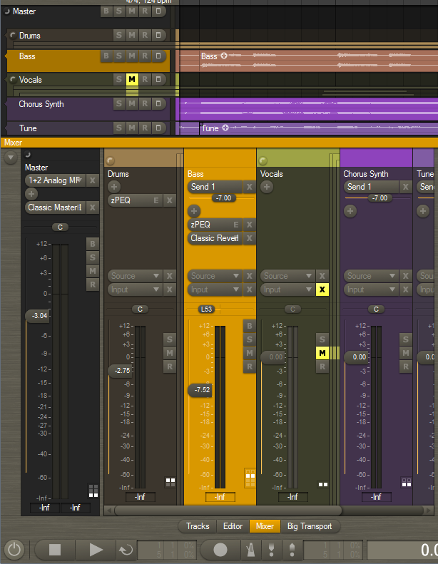
The colors setup dialog has been extended with settings for “rack/header/strip opacity” and “lane background opacity”. These settings have thus been removed from the tracks region dialog, as they are now applied globally. It also means that the rack, track headers and mixer strips will always have a consistent and similar look.
I think you must round the right side of mute buttons [X] also, since they will give more empty space between mixer strips.
I’d like them to appear similar to and horizontally aligned with the BSMR buttons below. That’s why I made them square in the mixer.
ZynewaveKeymaster@Zynewave wrote:
I expect to have a beta with the first mixer changes ready this weekend.
I ended up rewriting more than first planned, so I don’t quite have a beta ready yet. Here’s a screenshot of my progress so far:
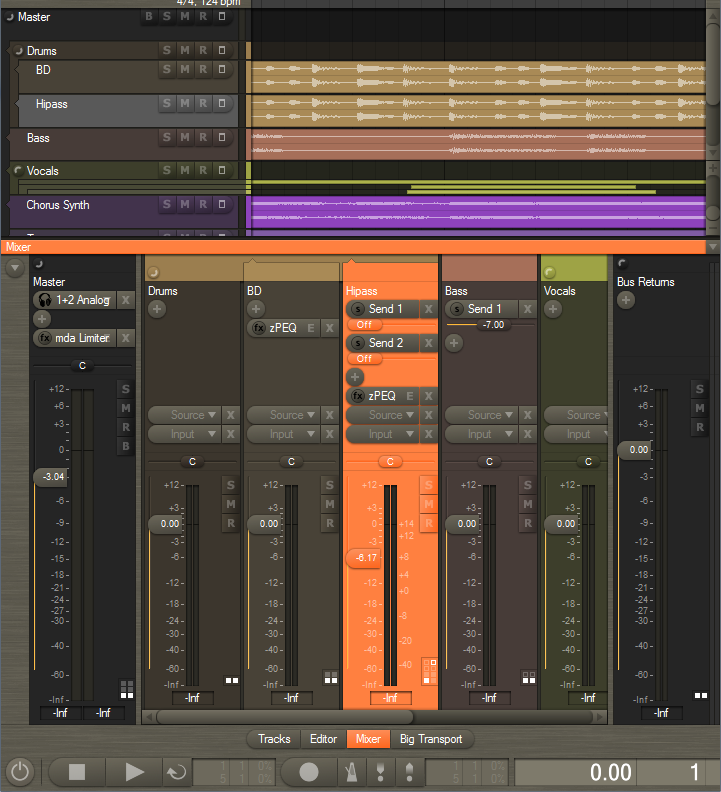
Please post your comments on the new design.
Notice the old +/- track group icons are replaced with new round buttons.
I am undecided whether the slider knobs in the mixer (and rack and track headers) should assume the color of the background, or if they should be the default button color. What would you prefer?
ZynewaveKeymasterThanks for all the bug reports. I’ll get back to them soon. I’ve begun the redesign of the mixer. I wanted to make sure the chain panel code can be modeled to work on the mixer strips, before I start chasing bugs. I expect to have a beta with the first mixer changes ready this weekend.
ZynewaveKeymasterBeta 8:
Renamed “Group Panel” to “Rack”. Calling it “Rack” will of course make more sense once I implement the embedded plugin editors.
Added a “Lists” option button to the inspector. This will toggle the object assignment panels at the bottom. If anyone has a better description than “Lists”, let me know. I prefer it to be a single word and short.
The track select button no longer doubles as track menu. Instead right-clicking on the selector will open the track menu. That way the effect track menus are also available on the track headers and eventually in the mixer strips.
The tracks region options are also done. You can select to show: gain/pan/send controls, effect chain, source selector and input selector.
Question to you all:
2.23 is turning out to be a major face-lift of the track UI. I’m guessing I need a couple of weeks to update the mixer to the new chain design. I wonder if I should delay the release of 2.23 so that it includes the changes to the mixer?
ZynewaveKeymaster@thcilnnahoj wrote:
@Zynewave wrote:
In beta6 the effect record buttons are finally gone. The track lane record button will also record enable all plugin effect tracks.
So if I got this right the correct way to record only automation now is to either just bypass the input (from my experience, auto-assigned audio inputs don’t overwrite anything anyway), or create the parameter track in advance and set it to record by itself?
Yes.
I can’t find the post anymore, but you said something like you were planning not to display effect chains on the track headers, and instead add a button that would open an overlay for track management. Are you still considering this or do you think the new GP should be generally used for viewing and rearranging effects? I think if I want to see a track’s effect chain in the arrangement view, I’d prefer this overlay box to zooming in or resizing the track.
I mentioned that idea before I started working on the new chain panel design. I think I’ve managed to simplify the chain management significantly, so I no longer feel it’s necessary to add a popup panel with larger and more spaced out controls. The new track inspector group panel does that job well, I think.
I’m keeping the controls on the track headers for the same reason, and also because the elements now are shown/hidden depending on the zoomed track height. It is no longer partially cut, as would happen with the old design. The tracks region options I’m currently working on will enable you to hide some or all of the controls on the track header, if you prefer a clean design.
Another thought I have about the future mixer redesign:
I plan to take the same chain panel that is now used in the inspector and track headers, and use it in the mixer strips as well. The bottom part of the mixer strips will remain largely as it is, but the entire top half where you manage plugins and sends will be replaced by the new chain panel. The button design will be slightly different to accomodate for the narrow space of the strips.
I think it is more user friendly that you use the same type of effect/track management in the inspector, track headers and mixer strips. With all the recent changes to the inspector/track headers, the mixer is in a state of limbo at the moment.
ZynewaveKeymaster@thcilnnahoj wrote:
Edit: Ooh, there’s drag-and drop rearranging of effects on the track header! If possible, pop-up help should close as soon as you start to click-drag an effect track, otherwise you can’t see where you’re dropping it.
That’s fixed in beta7, which is now uploaded. Also the dragging up/down is modified slightly.
And something a little off-topic. I recently wiped the dust off an old laptop computer; it has a native screen resolution of 1400×1050… on a measly 14″ screen. 🙄
Text in Podium is awfully small that way, and changing DPI settings in Windows doesn’t help. This is no request – I’m just curious – have you ever thought about changing Podium’s font for a heavier one, or using the system’s font?I am keeping in mind that, at some point I need to provide an overall size scale setting for the UI elements. Personally I’m excited about the new multi-touch capability of Windows 7. My next PC purchase will support some kind of multi-touch, either as a laptop/tablet, or using a standalone multi-touch monitor. In the wake of the Windows 7 release, there are a lot of new devices coming out that supports multi-touch.
So to be able to comfortably work with finger touching, I’m going to implement an overall “finger size” setting in Podium, which will adjust the size of all buttons. That way the user can easily adjust to whatever screen DPI is used with the touch interface. That is one of the reasons why I’m substituting the old flat group panel with the new resizable button style.
ZynewaveKeymasterView menu -> Customize editor profile
Select the region below “Tracks” in the list.
Click “insert new” -> scrollbar
ZynewaveKeymasterThe horizontal timeline scrollbar has been replaced by the new navigator in the default setup. You can get back the old scrollbar by adding a “scrollbar” region in the editor profile properties dialog.
ZynewaveKeymaster@thcilnnahoj wrote:
@thcilnnahoj wrote:
Podium lets you have pretty much an unlimited number of effect tracks! If you want 8 effects, just add them…
To be fair, this is not entirely true, maybe simply due to a bug: If I keep adding effects, at a certain amount the new effect tracks will not be added into the chain correctly. It’s best to try and see for yourself what happens. 😛
Also, if you were to have a mad chain of 30+ effects, at some point the group panel will start to extend beyond the screen. The scenario is unlikely, I’d say, but maybe a little “show/hide effects” button or a scrollbar would be in order in the GP.
The 30+ limitation will be removed at some point. It was necessary back when we had the expanded track layout mode.
And I’ll add a scrollbar to the group panel (rack) later on, when I implement embedded plugin editors. The scrollbar will of course only show if the rack does not fit in the inspector.